The ValueSpends app was designed with the goal of empowering users to make more mindful purchasing decisions by reducing impulse buying and guiding them towards investing their money in the things that truly align with their values.
UX/UI Designer
Solo school project
October - November, 2022 (8 weeks)
Figma, Miro, Adobe Photoshop
This school project reflects my passion for minimalist lifestyle and demonstrates how I adopted this mindset in my design approach. I believe that owning fewer non-essential items frees up time, money, and energy for things that truly matter. With this in mind, I designed an app that assists users in setting meaningful goals and compares the value of money to other important things, such as working hours or a dream vacation. By using the app, users gain a deeper understanding of the true value of their money, making it easier for them to avoid impulse buying and prioritise what's truly important to them.
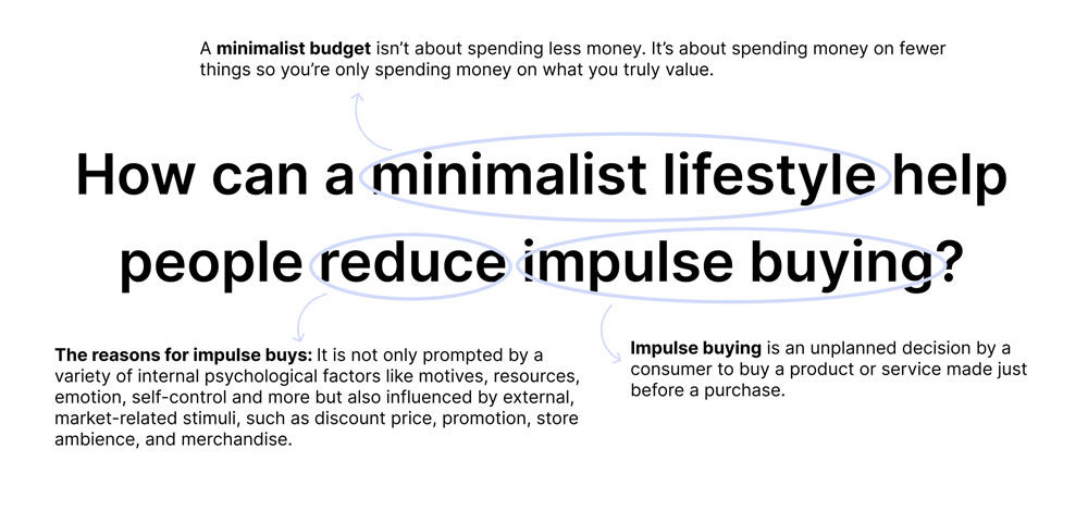
Impulse buying poses a significant challenge for individuals striving to achieve their financial objectives. Furthermore, it can potentially lead to debt and hinder the ability to save money for more meaningful endeavours.
"How might we help people reduce impulse buying so they can better use their money, time and energy for the things that truly matter in their life."
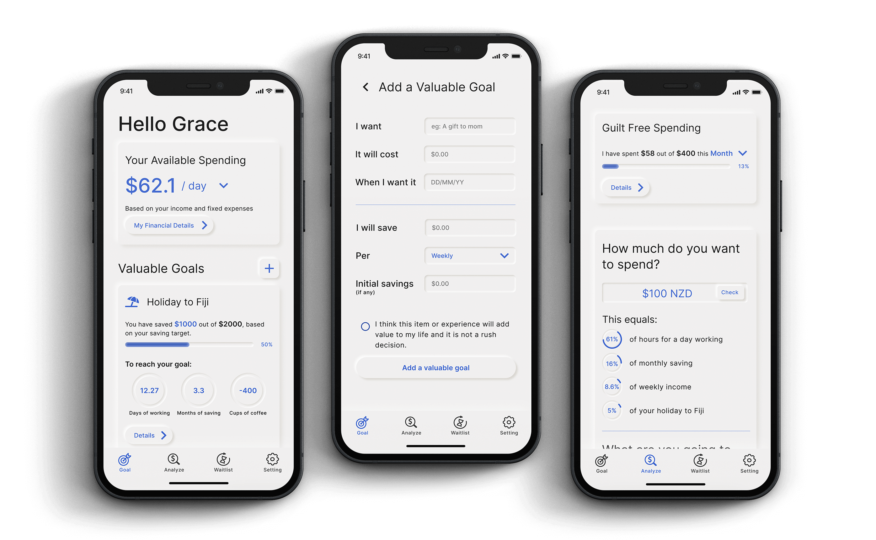
ValueSpends is an innovative mobile app that empowers users to make more mindful purchasing decisions. The app offers a range of features, including a budget tracker, goal-setting tool, and an analysis system that encourages users to think critically about their purchases. Additionally, it includes a waitlist tool to help users delay impulsive purchases. By using ValueSpends, users can gain a better understanding of the true value of their money and make more intentional spending choices that support their long-term financial and personal goals.

In my passion project, I have crafted the research question: How can a minimalist lifestyle help people reduce impulse buying?
By exploring the concept of a minimalist lifestyle, examining the phenomenon of impulse buying, and investigating its underlying causes, I aim to discover the potential benefits of a minimalist lifestyle in curbing impulsive spending behaviours.
Goal: The goal of the interview is to gain a deeper understanding of how individuals react to and feel about impulse buying. Specifically, I aim to explore their approaches to dealing with impulsive purchases, such as how they define an impulse buy and what strategies they use to prevent it.
Additionally, I seek to discover how people's goals and values relate to their spending habits. Are their goals aligned with their values, and how do these factors influence their buying decisions?
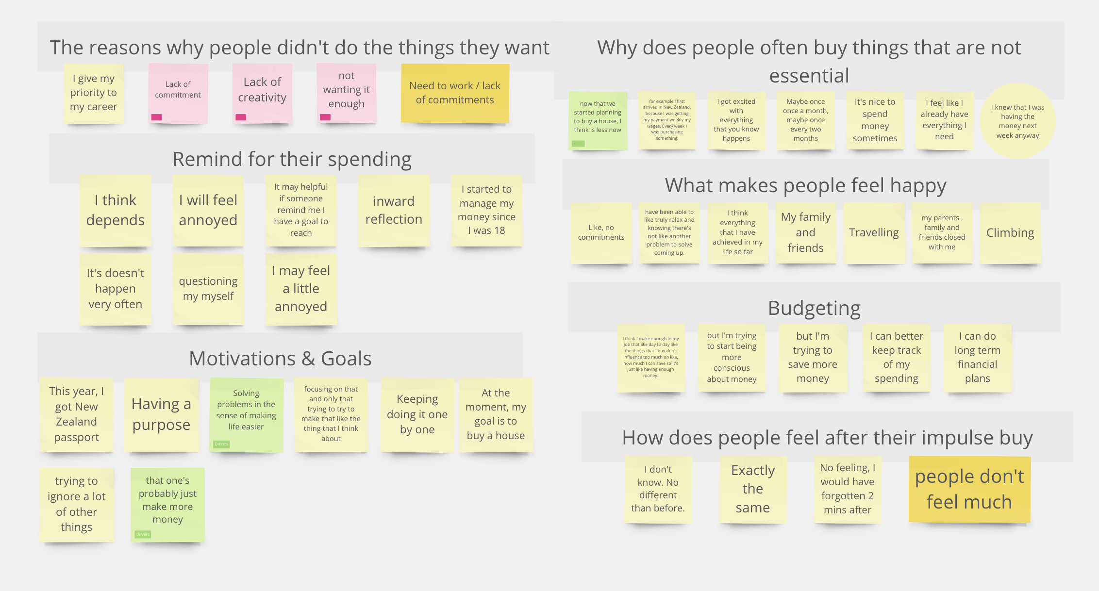
Method: To achieve these objectives, I conducted in-person interviews with eight participants from diverse countries, ranging in age from 19 to 45. I created an interview script consisting of 20 open-ended questions that focused on exploring the participants' values, motivations, and approaches to curbing impulsive buying behaviours. Using the transcription app Otter, I recorded the interviews and then listened to them again after all the interviews were completed. I then used the online tool Miro to organise and analyse the responses.
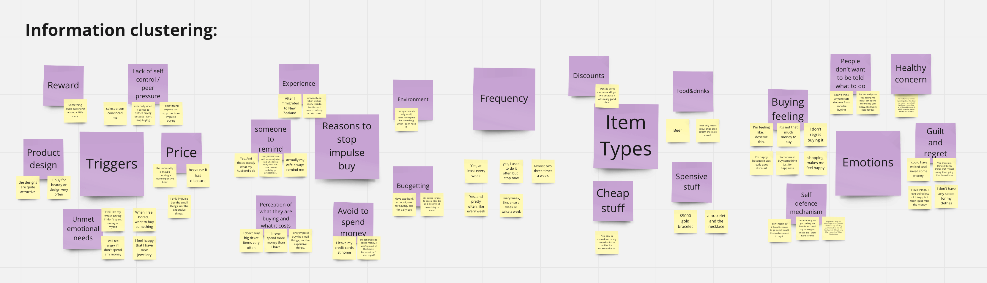
Insights: Through analysing and organising the raw interview data, I gained valuable insights that helped further develop my research.
After collecting all the insights from the interviews, I began exploring how to develop the app with a minimalist lifestyle mindset to help people reduce impulse buying. So first, I defined the problem statement for the app: How might we help people reduce impulse buying so they can better use their money, time and energy for the things that truly matter in their life.
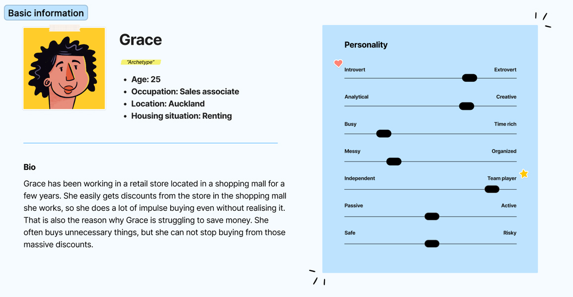
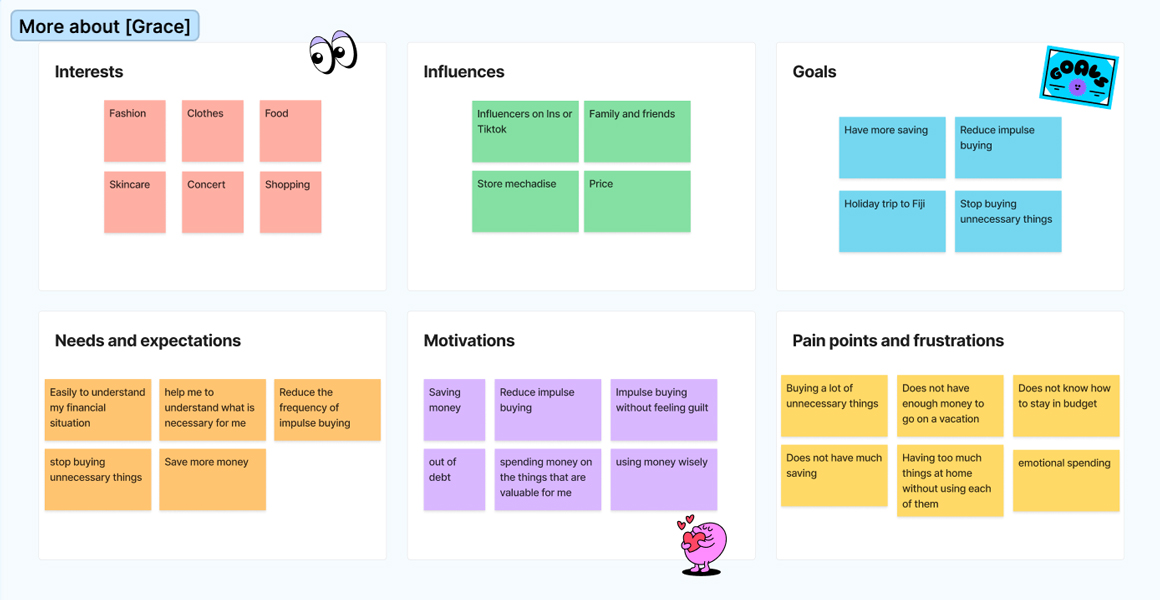
I developed a persona to visualise the target audience, comprising individuals aged 20 to 40 who have a penchant for impulse buying. This persona allows me to empathise with the user's goals and needs, and it also serves as a reference throughout my design process, ensuring that my decisions align with user expectations.
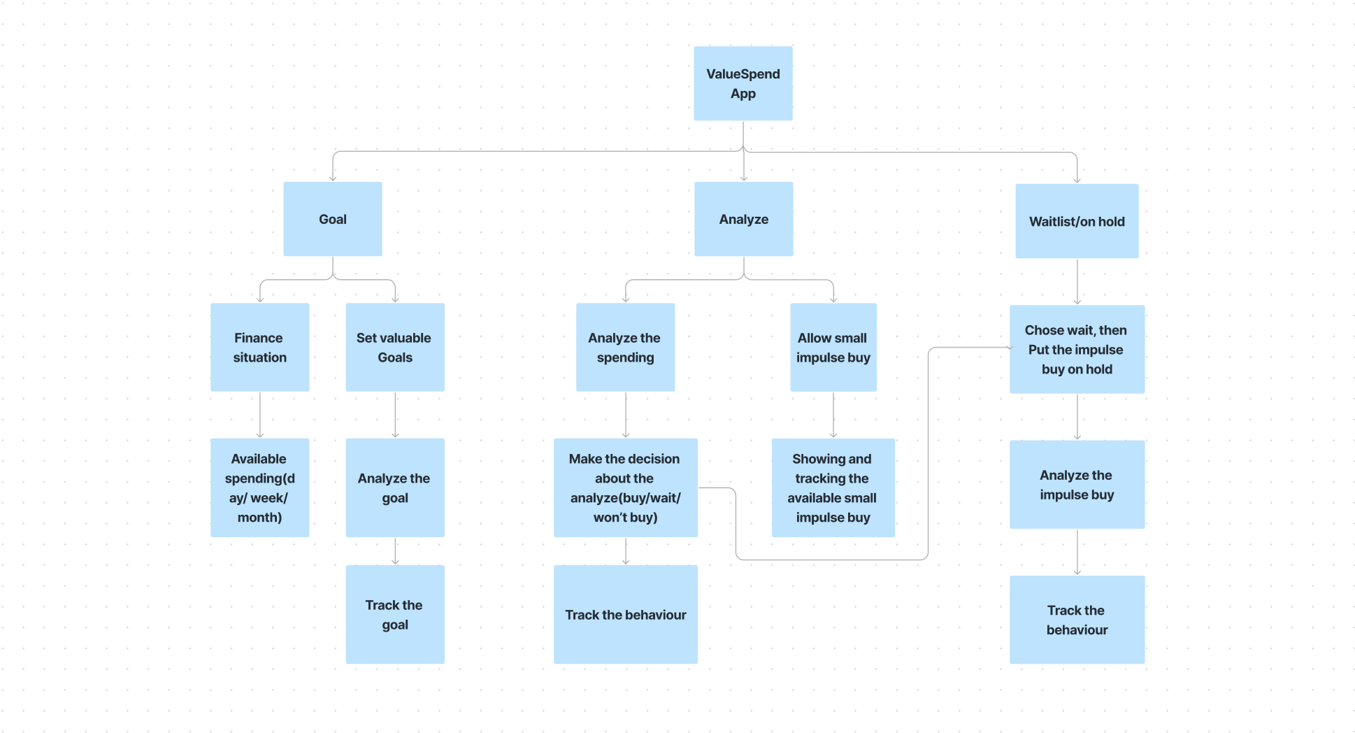
Next, once I had a solid understanding of my users and their requirements, I began organising and structuring the app's content and functionality in a logical and intuitive manner. This led me to create a preliminary app structure.
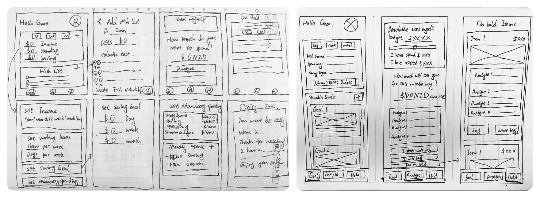
Afterwards, before moving to digital design, I quickly sketched the app layout on paper. This is an excellent way to test different ideas and gain a general sense of how the user experience would flow.
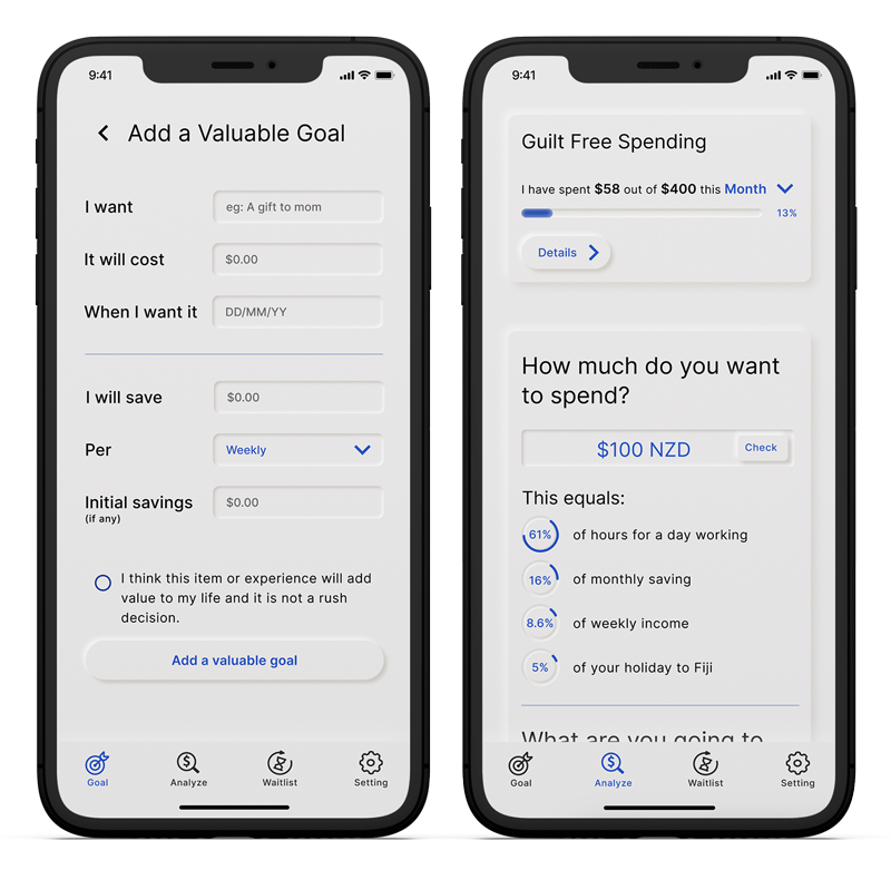
To create low-fidelity prototypes, I used Figma to translate my sketches into digital designs. The app consists of three primary screens: the GOAL page, the ANALYZE page, and the HOLD page.
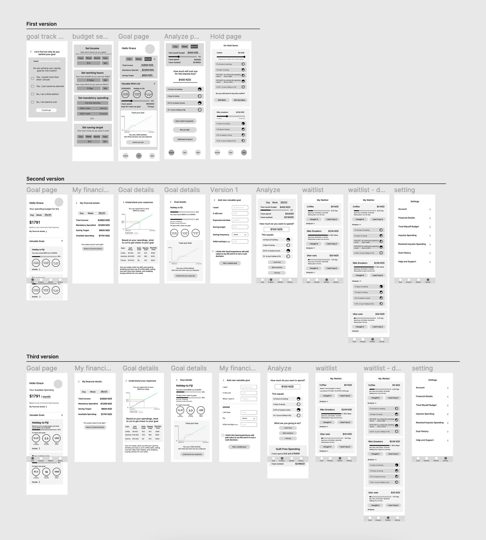
After creating the low-fidelity prototypes, I conducted user testing to evaluate their effectiveness. The goal was to assess how easily users could comprehend each screen without any explanation. Based on the user testing results, I made several improvements to the design.
Here are the key results from the user testing that informed my design improvements:
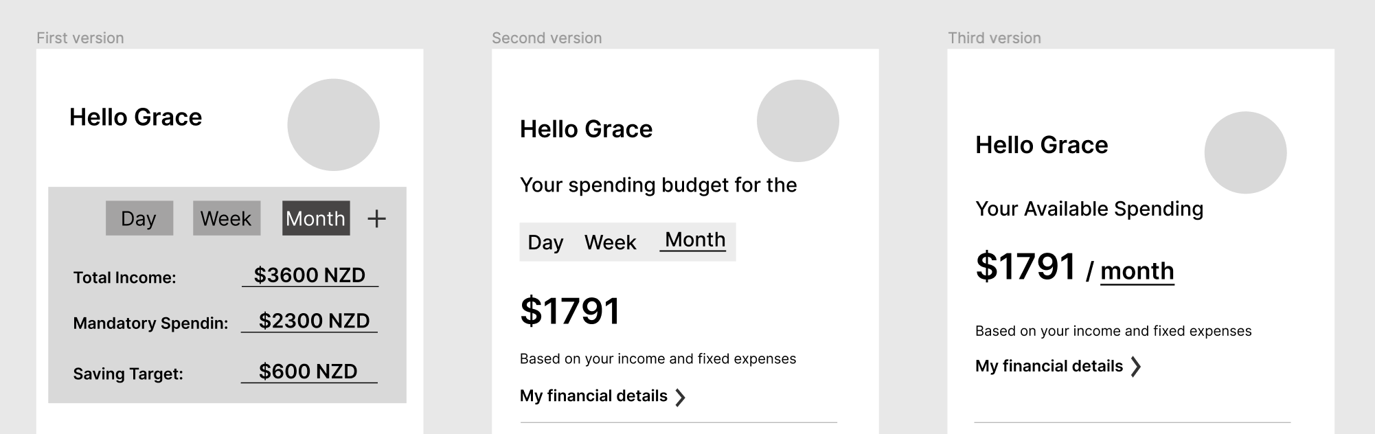
To avoid overwhelming the user, reduce the amount of information displayed on the screen and only shows the essential details the user desires to see.
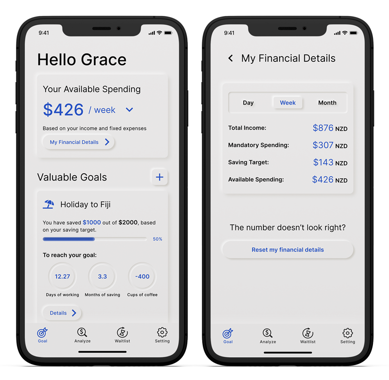
On the goal page, only available spending is displayed, as this is what users are most interested in. However, during user testing, one participant preferred the option to hide financial details, expressing concern about privacy while using the app in public places.
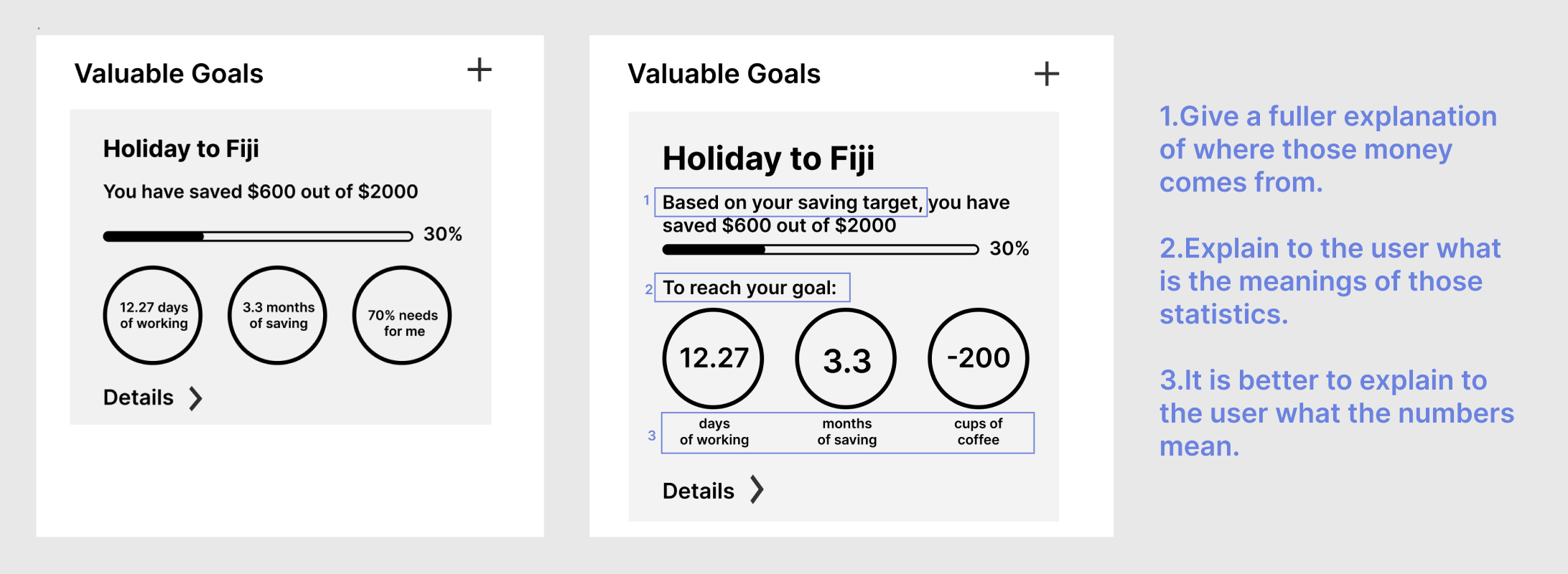
Provide further explanation to assist the user.
I used three diagrams to translate the idea of money into the number of working hours, the amount of time to save, and the negative number of the personalised impulse purchase on the goal page’s section titled “Valuable Goals.” Without explanation, the user could find the statistics confusing.
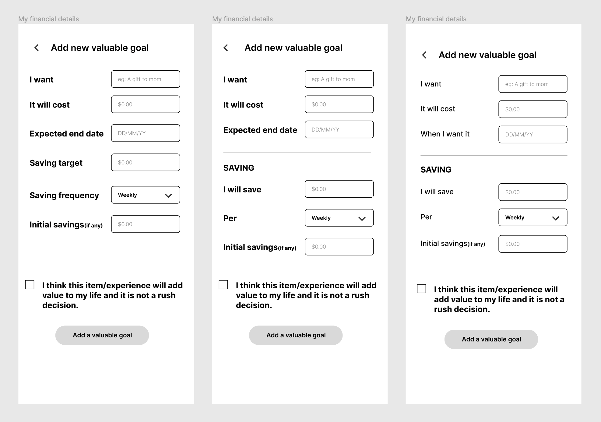
Rephrase the sentence to improve user comprehension.
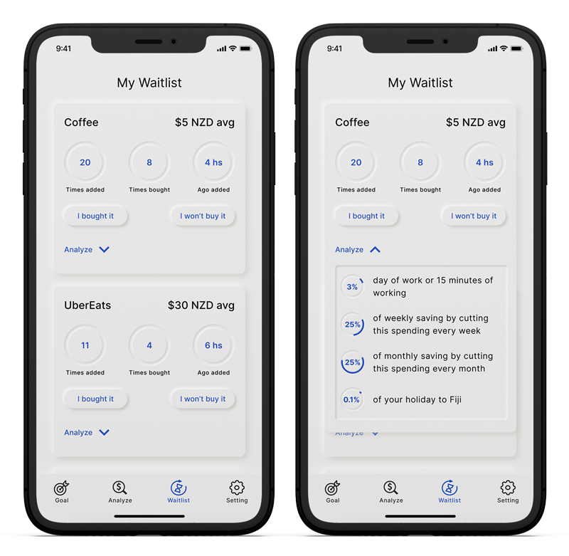
To improve user understanding, I changed the terminology on the Hold page from Hold to Waitlist, which makes it more evident that users need to wait before making a purchase. On the "Add New Valuable Goal" page, I simplified the language to enhance user comprehension. I also restructured the table content, dividing it into logical groups and adding headings to visually differentiate the sections. This makes it easier for users to locate specific items in the table, enhancing the overall user experience.
To ensure visual consistency and coherence, I leveraged the design system. This system involved the creation of a set of standardised components, such as buttons, fonts, colours, and layout guidelines. These elements work harmoniously to deliver a unified and seamless user experience.
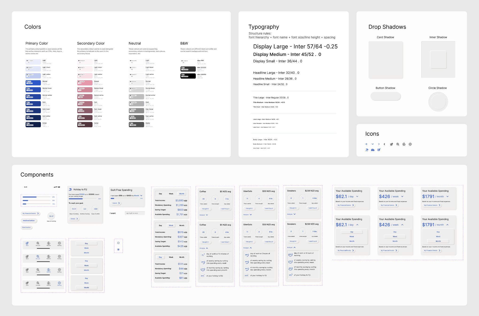
After addressing the usability issues, I proceeded to craft high-fidelity prototypes using Figma. For the design approach, I embraced neumorphism, also known as soft UI design, which leverages background colours, shapes, gradients, highlights, and shadows to achieve a subtle 3D effect, thus fostering a clean and minimalist aesthetic.
Check out the Figma high-fidelity prototype:
Next Steps
During this school passion project, I gained valuable experience in conducting interviews as part of the research process, and uncovered unexpected insights. It is important to plan your interview questions and use open-ended questions to allow the interviewee to reveal their inner thoughts.
Never assume the user would understand even though you think it is a very obvious design. So user testing is an essential part of the design process, and I constantly asked for feedback from my peers and lecturers to assist me in improving the design in terms of usability.
If I had more time to improve this project, some next steps would be: