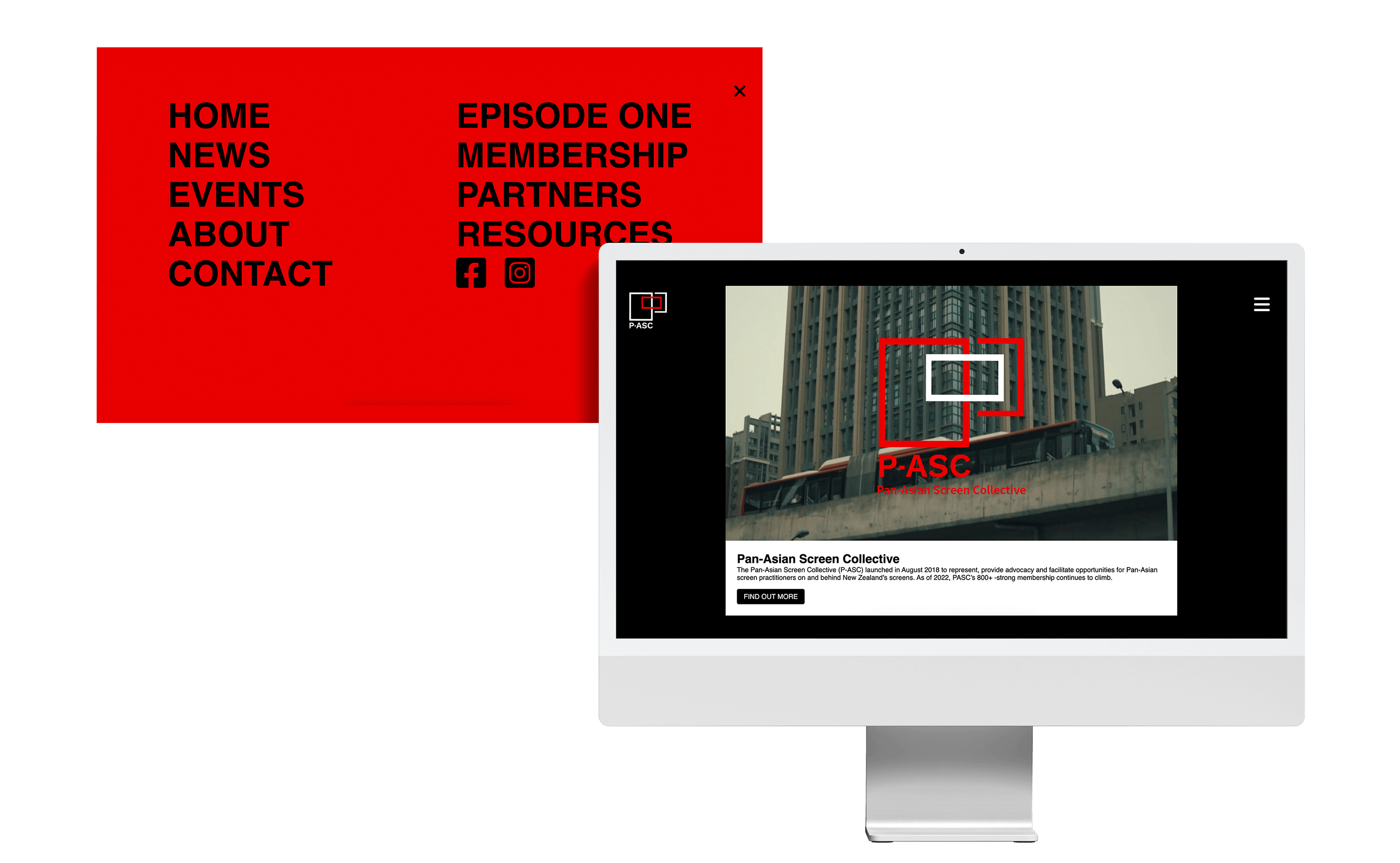
A school team project to rebrand and redesign the website for the client PASC(Pan Asian Screen Collective).
UX/UI Designerp
Front - End Development
Kaia - Graphic
Madeline - Graphic
Matt - Graphic
Sarah - Motion
Yu - Interactive
May - June, 2022 (6 weeks)
Adobe XD
Visual Studio Code
A team of 5 members collaborated to rebrand and redesign the PASC website, with a focus on improving accessibility, usability, and the overall user experience. As the website designer, my primary responsibility was to lead the redesign efforts and create a new membership section while incorporating the new rebranding system into the interface design.
Throughout the six-week project, we worked both independently and as a team to ensure consistency and progress towards our goals. We presented our progress to the clients three times, receiving constructive feedback that we used to refine our designs.
At the end of the project, our team received an A+ for our final output, which was a testament to our dedication and hard work in delivering a high-quality product. It was my first experience collaborating with others on a project, and I learned valuable lessons on teamwork, communication, and the importance of incorporating feedback into the design process.
The Pan-Asian Screen Collective (P-ASC) launched in August 2018 to represent, provide advocacy and facilitate opportunities for Pan-Asian screen practitioners on and behind New Zealand’s screens.
Firstly, its visual system was outdated, cluttered, and lacked any sense of excitement or modernity. The navigation system was confusing and difficult to follow, leading to a poor user experience.
Secondly, the core offerings of PASC were not clearly emphasised, making it difficult for users to understand what the organisation does and what it has to offer.
Finally, some pages were left empty, which could disappoint users and make them question the organisation's reliability and credibility.
To redesign the PASC website, I conducted an analysis of the current website to identify areas for improvement to address business and user needs. I discovered several issues that could potentially discourage users from using the website:
With these issues in mind, We established several design goals to guide the redesign process:
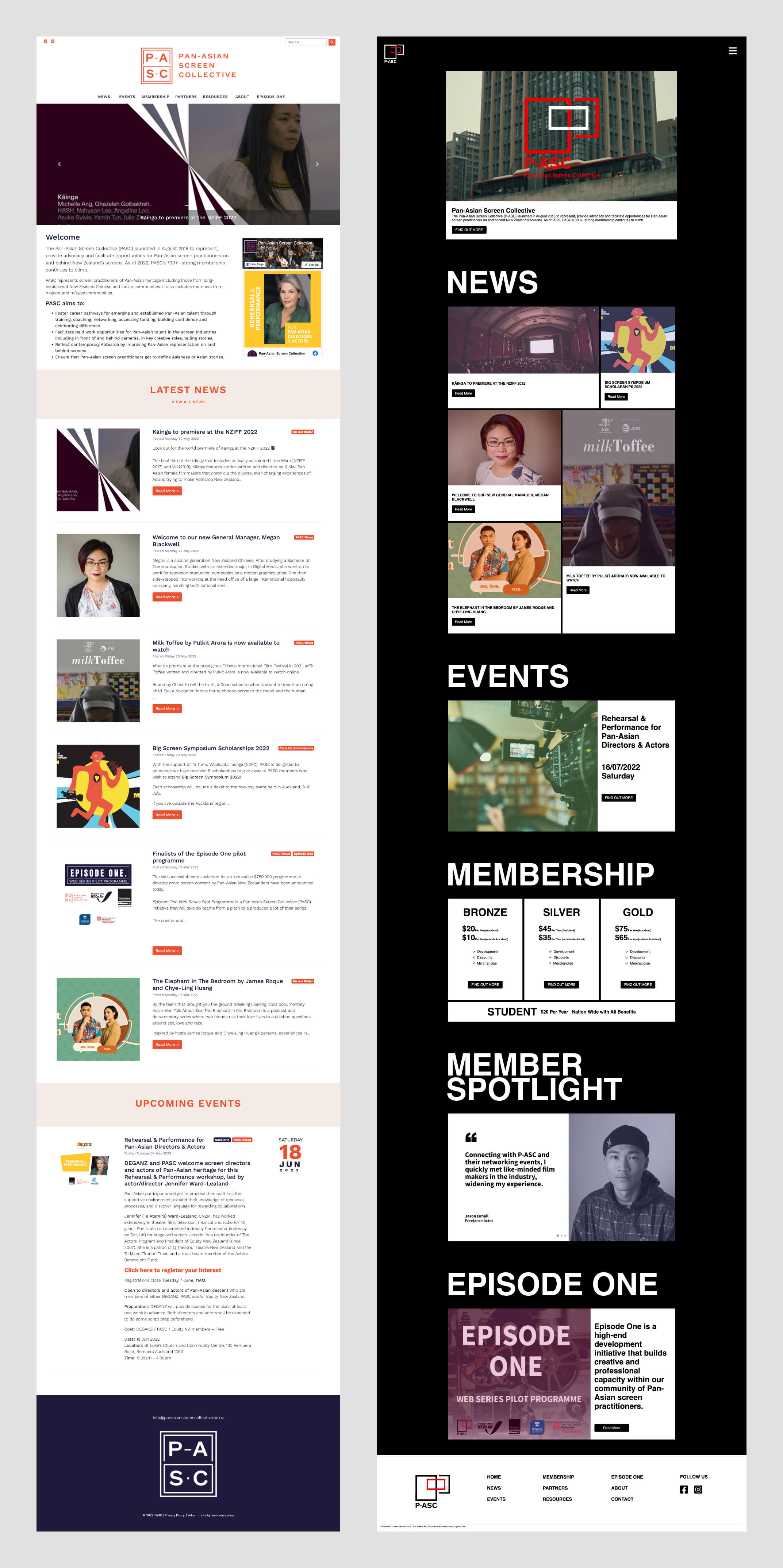
To evaluate the changes, it would be helpful to view the original PASC website alongside the redesigned version.

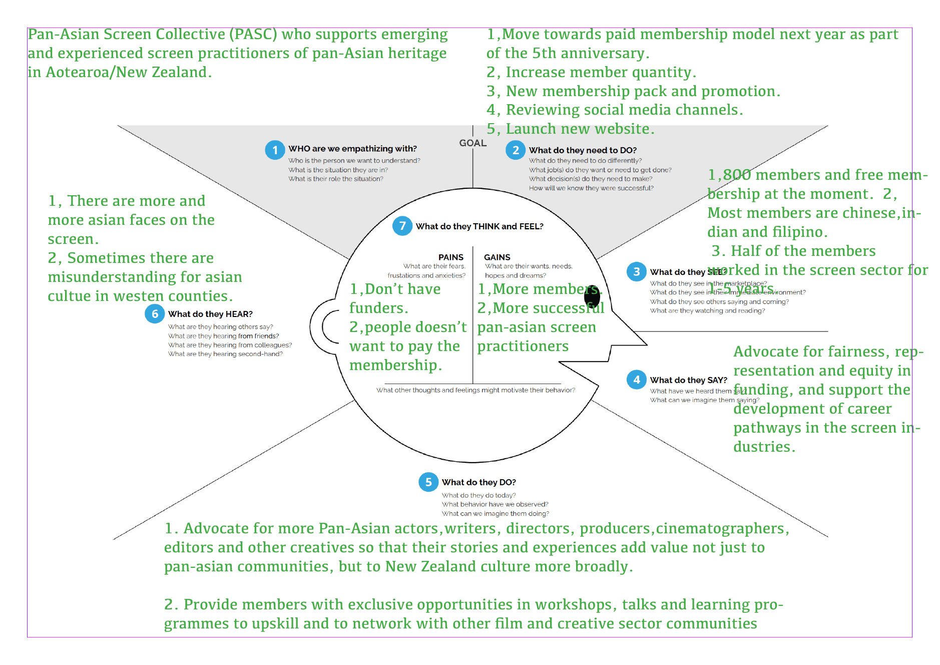
PASC's target users are individuals of Pan-Asian heritage who are involved in the screen industry and reside in Aotearoa.
To gain a better understanding of the target audience, we conducted an empathy mapping exercise, which allowed us to develop a deeper insight into their needs, motivations, and pain points.
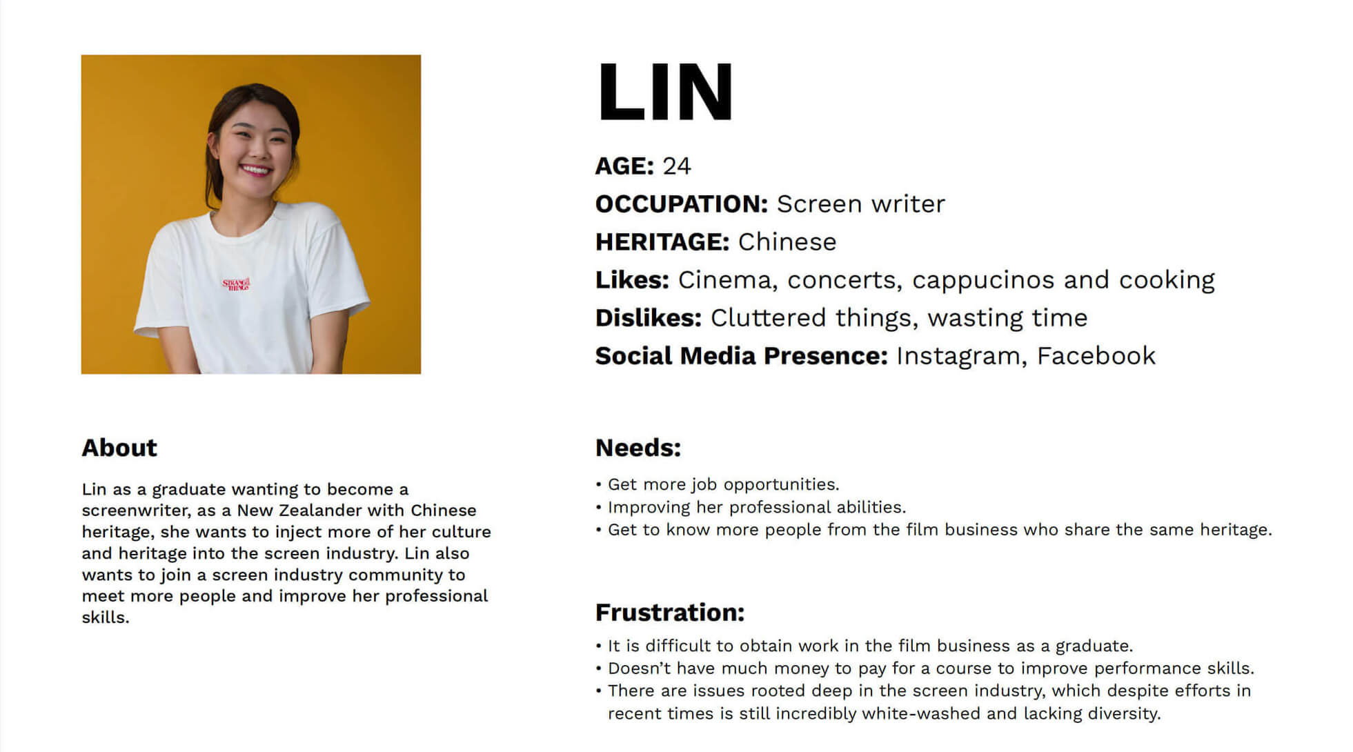
The industries' demographic expands to ages from as young as 18 and as old as 60, so we decided to narrow down the age range from 23 to 28 while keeping the doors open for all eligible ages.
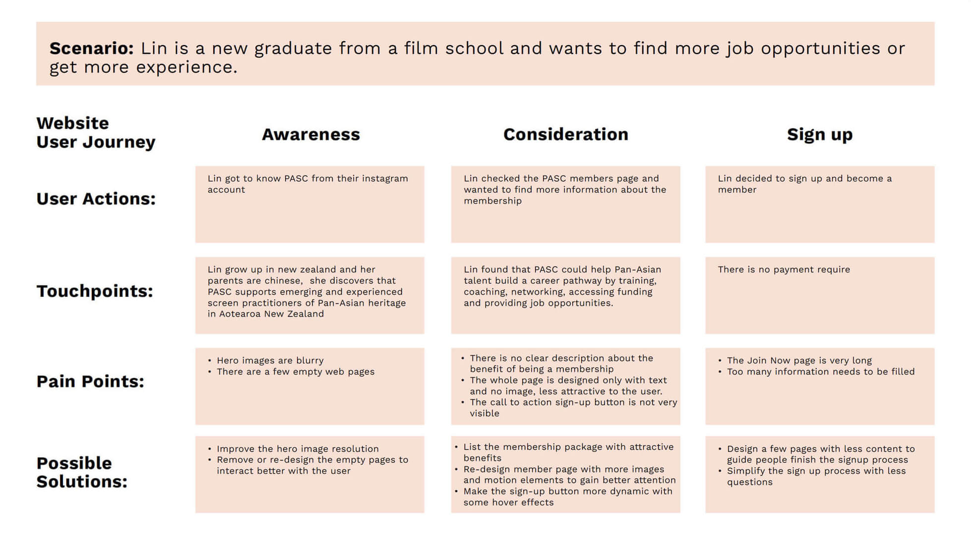
In order to gain a better understanding of the user, we created a persona named Lin and conducted a user journey analysis to identify pain points and potential solutions on the original website.
To gain insight into the user experience of the current PASC website, we developed a user journey map that visualises potential scenarios in which users may interact with the website. This includes discovering information about PASC, understanding the benefits of membership, and exploring available events.
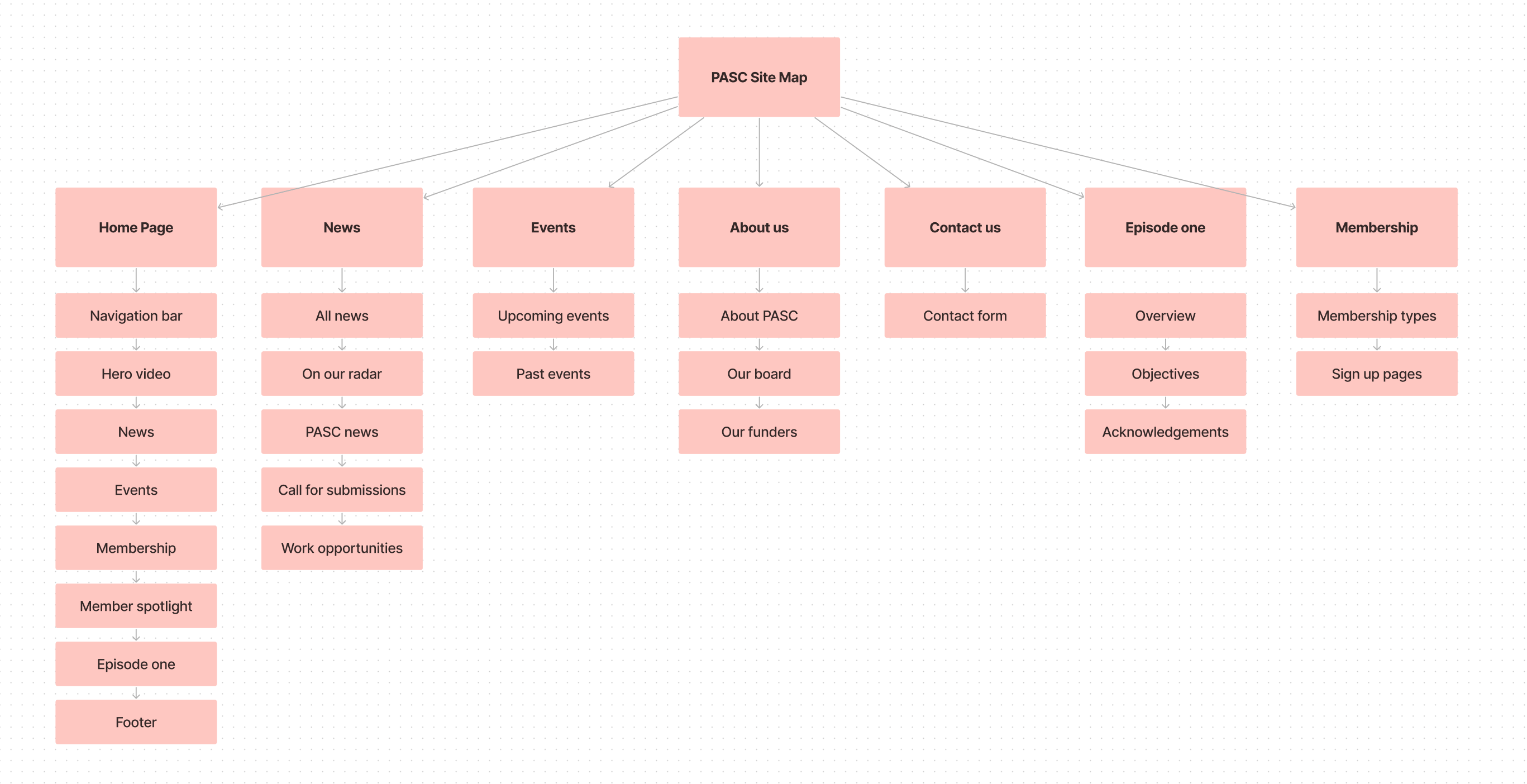
Here is the new site map for PASC's website. While maintaining a similar structure to the original site, I have made some changes to the homepage to improve its functionality and user experience.
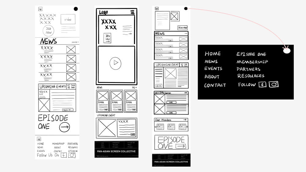
After I got the site map, I initiated the process of exploring potential website designs. I began by sketching some screens and subsequently presented them to my team for further discussion and testing to refine the designs.
The website's visual system depends on the rebranding outcome as a collaborative project. As a result, the prototypes were modified several times based on feedback and suggestions from the team, lectures, and clients.
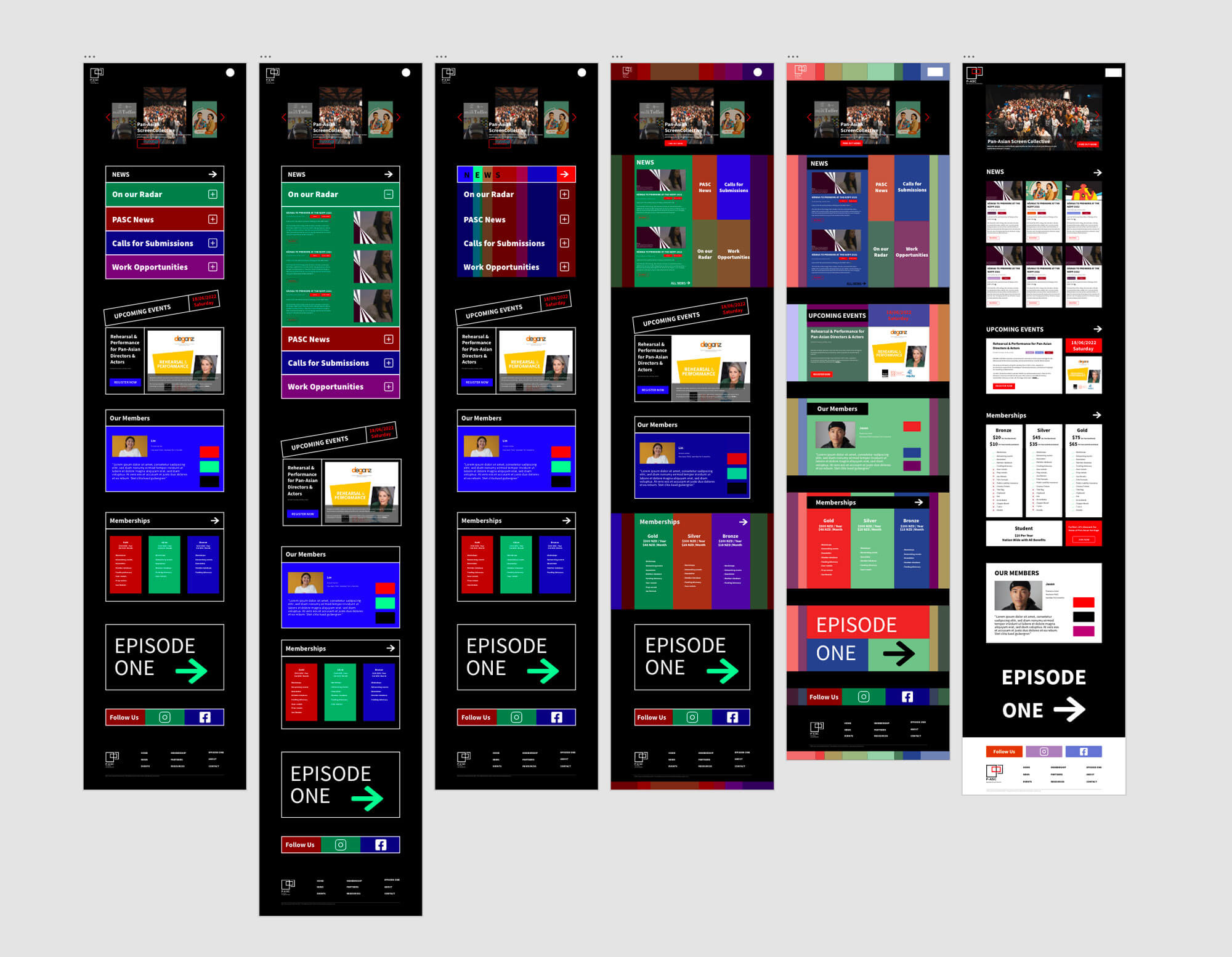
P-ASC's new website is fully aligned with the new brand identity. Upon entering the website, users are greeted with an animated brand identity, which not only helps them to understand the P-ASC brand but also emphasises the importance of moving images. The main page features five sections, including NEWS, EVENTS, MEMBERSHIP, MEMBER SPOTLIGHT, and EPISODE ONE.
To accommodate PASC's upcoming paid membership plan, we added a dedicated membership section that highlights the various pricing plans and associated benefits. Additionally, we added a new section called Member Spotlight, featuring reviews from current members. This provides an excellent opportunity to showcase PASC and encourage more people to sign up.
I brought our design ideas to life by coding the website using HTML, CSS, and some JavaScript. Come see the improvements we've made in action by checking out the redesigned PASC website. Check the website here.
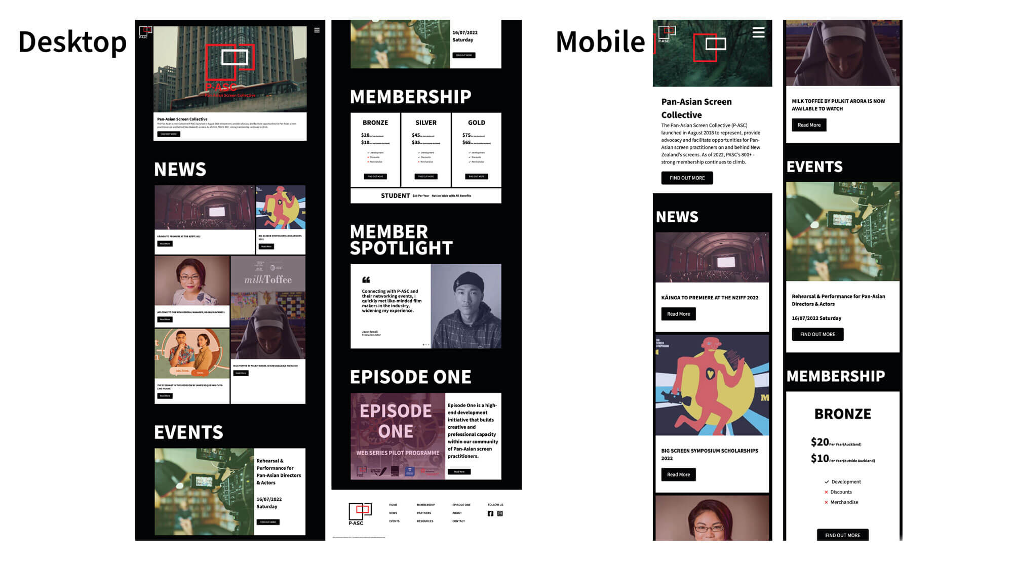
Mobile-friendly design to resonate with younger audience
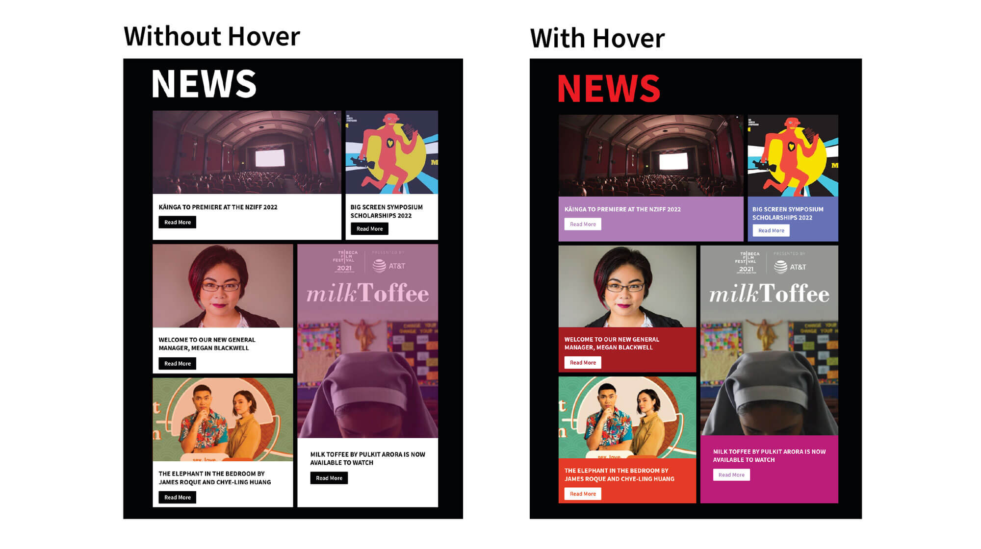
Engaging Visual Design with Dynamic Animations
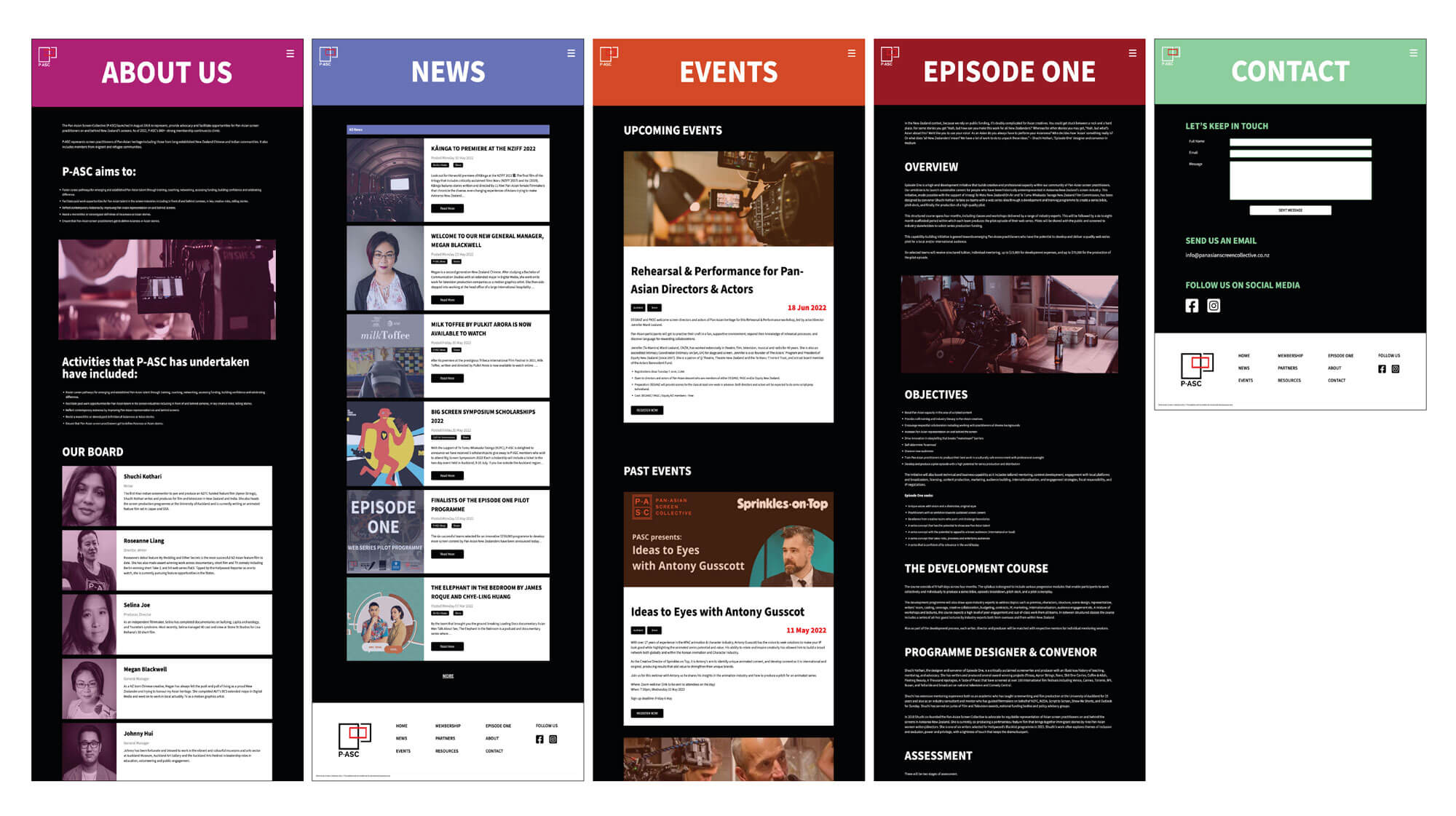
Enhanced user experience with unique brand color themes on secondary pages
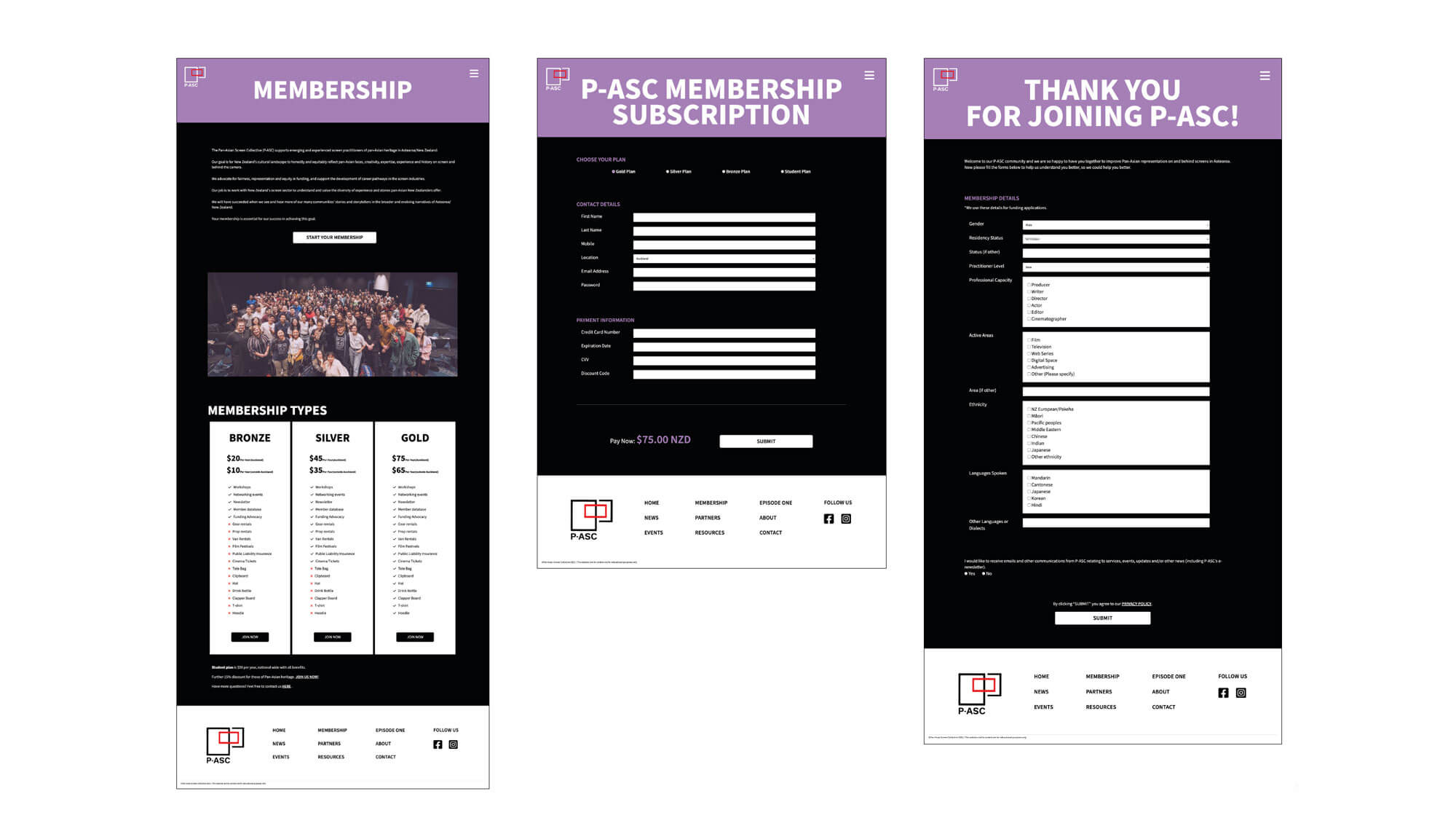
Streamlined membership signup process for improved user conversion
Next Steps
This project was a precious learning experience for me in so many ways. In six weeks, our team completed all of the tasks that had been assigned to us. I learnt a lot about the design process, collaboration, and how to balance my design choices with the opinions of others. Here are two key takeaways that will benefit my ongoing studies and career:
Understanding how to collaborate is critical.
While I had previous experience working in teams and communicating with all kinds of individuals, this was my first time working with designers from various
multidisciplinary fields. I had to learn to be more conscious and receptive to critical feedback, as well as how to adapt to the habits and methodologies of other designers.
As UI/UX designers, learning to code could help us understand what is possible within a product.
As a UX/UI designer and developer in this team, I started to understand that knowing coding can help me communicate
better with developers and have an understanding of what's possible and how to implement it. This project has helped me to gain new collaboration skills that will be useful for future projects.
