Cragging Day is an innovative application that serves as a bridge between traveling climbers and local enthusiasts, facilitating the seamless sharing of gear, local climbing knowledge, and cultural experiences.
UX/UI Designer
Solo capstone project
July - November, 2023 (14 weeks)
Figma, Miro, Adobe Photoshop
As a passionate rock climber, this project's origin stems from my personal experiences when I travelled to other countries. I often desired to engage in outdoor climbing, but found myself without my climbing gear, unfamiliar with local climbing spots, and lacking a climbing partner. That's when it struck me – there has to be a better way for climbers like me to enjoy the sport, even when far from home.
This project aims to address these challenges by developing 'Cragging Day,' an innovative app that bridges the gap between travelling climbers and local enthusiasts, enabling the seamless exchange of gear, local climbing knowledge, and cultural experiences.
Passionate rock climbers who want to enjoy climbing while travelling face problems like carrying heavy gear, not knowing good climbing spots, and not finding climbing partners. These challenges make it hard for them to have great climbing experiences during their trips.
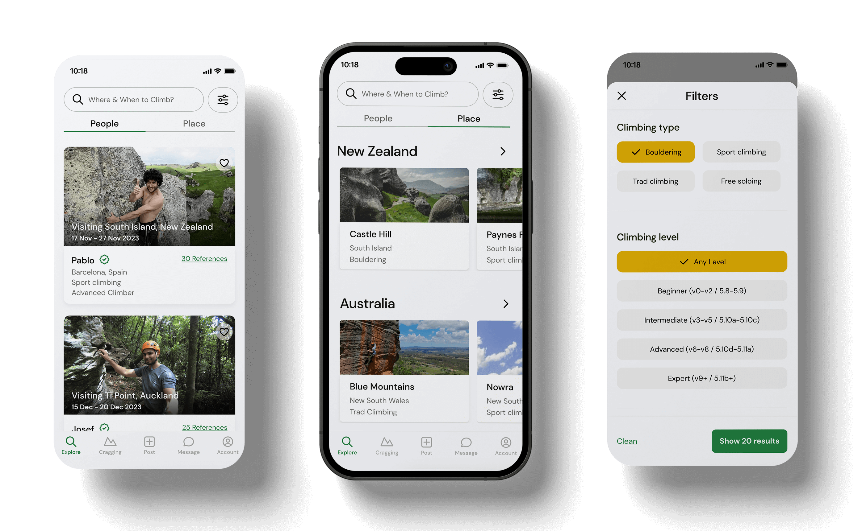
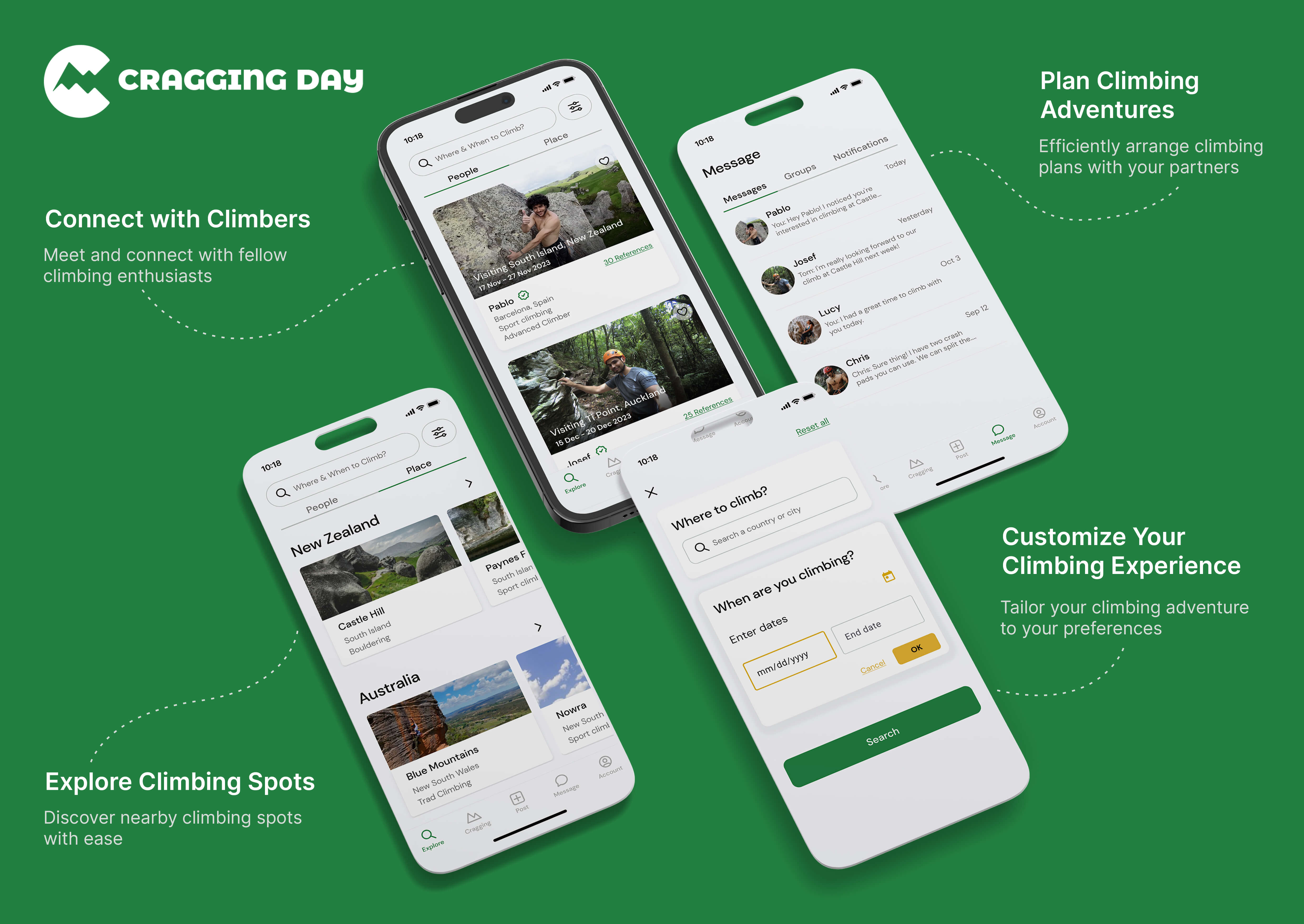
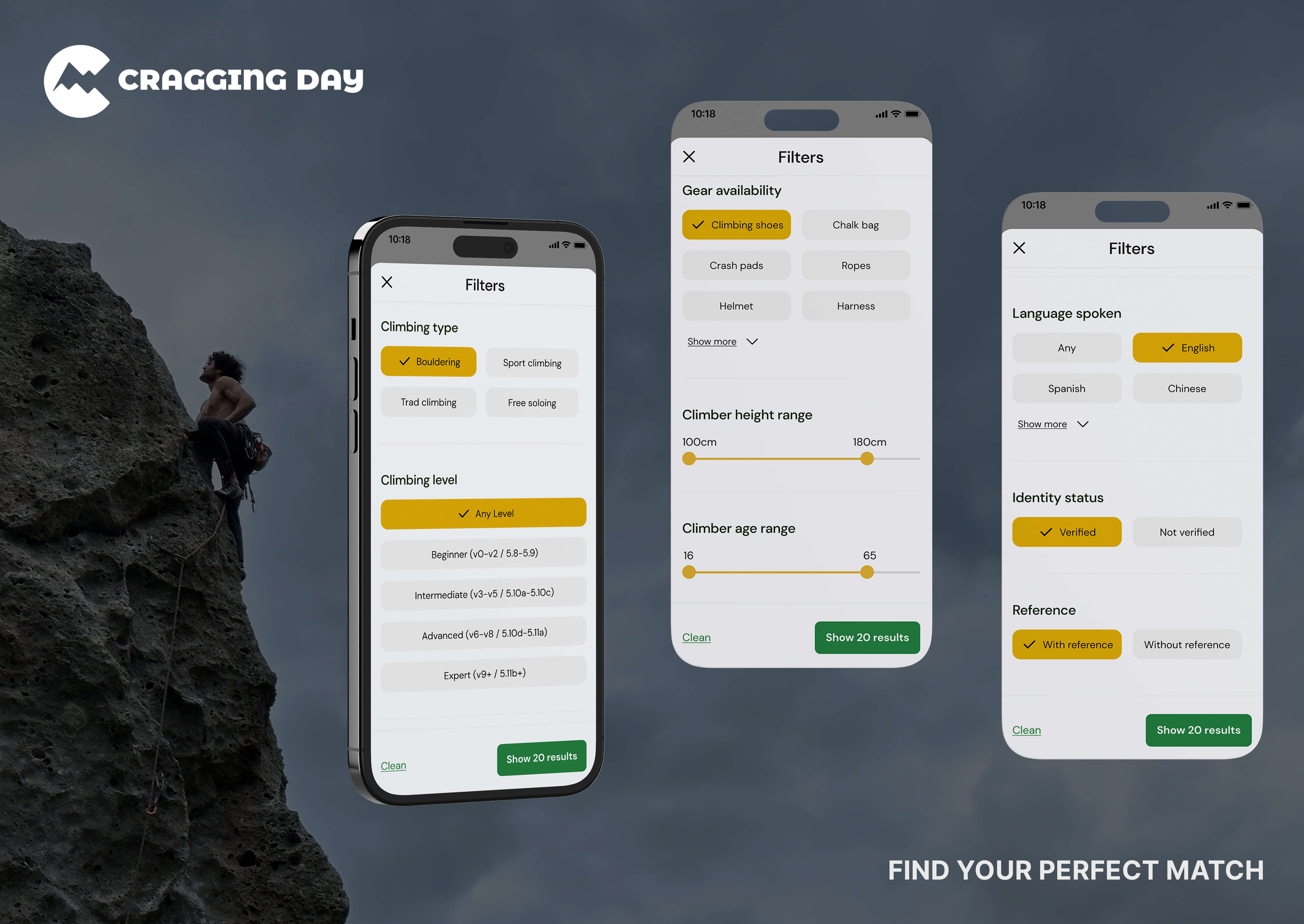
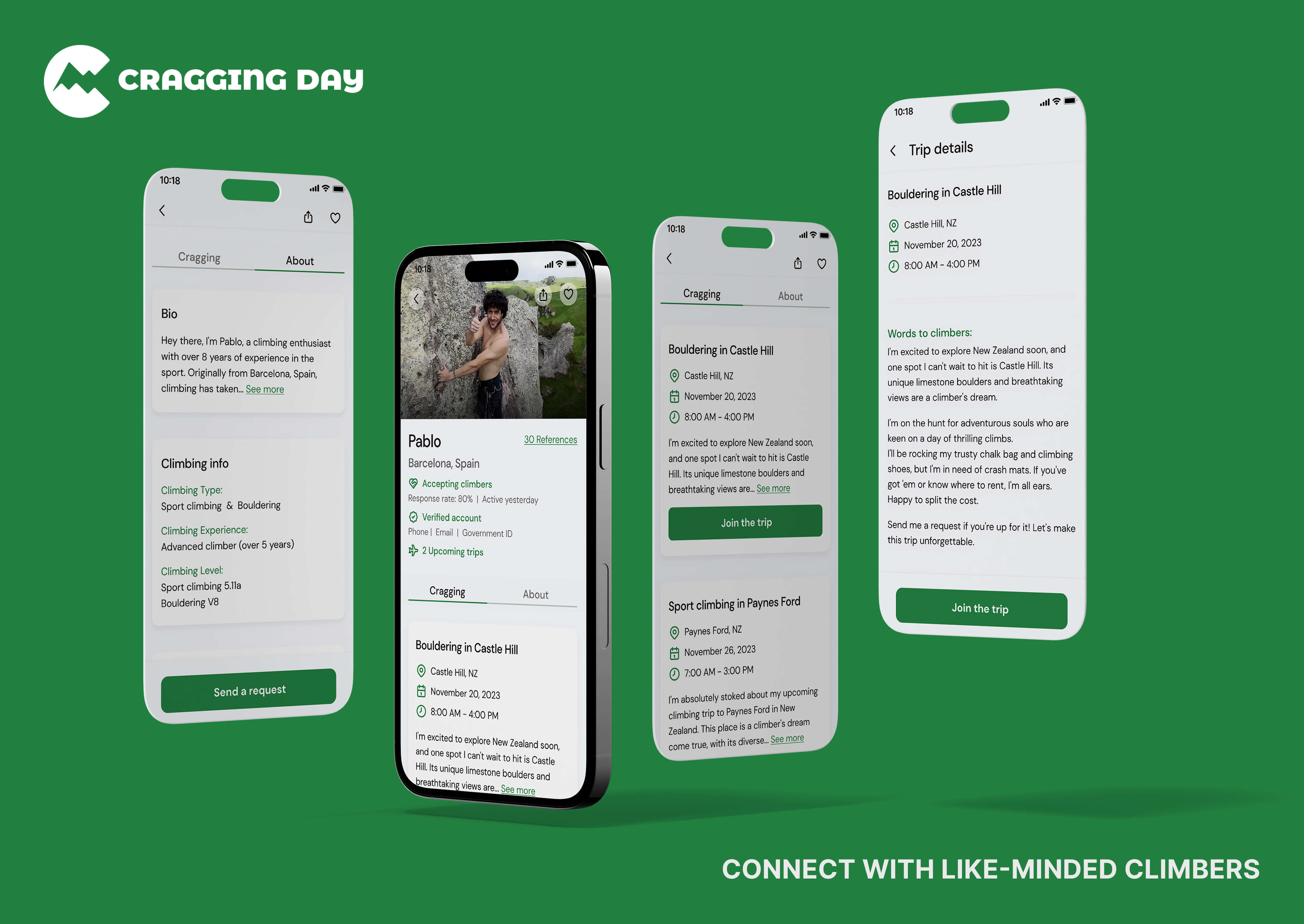
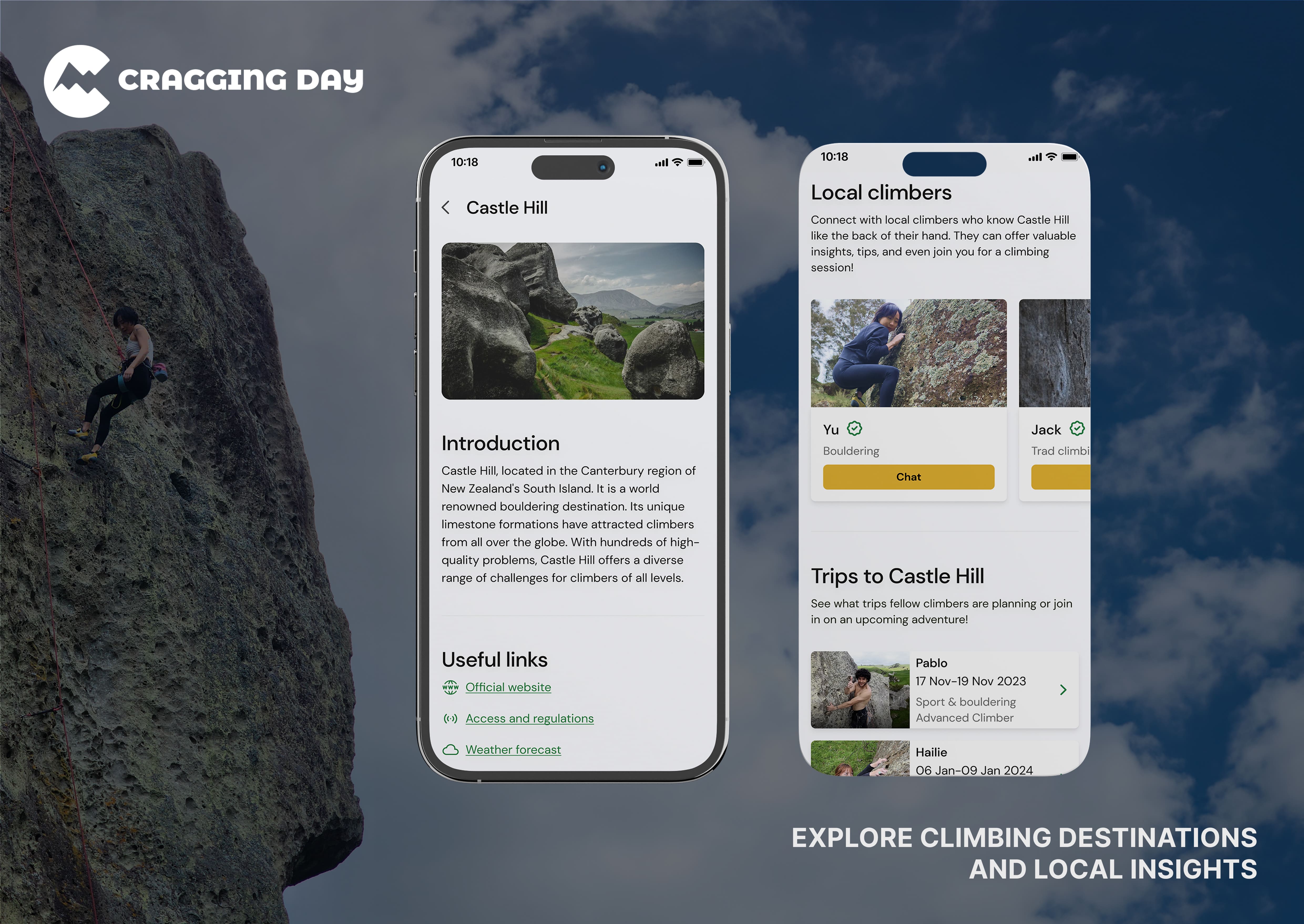
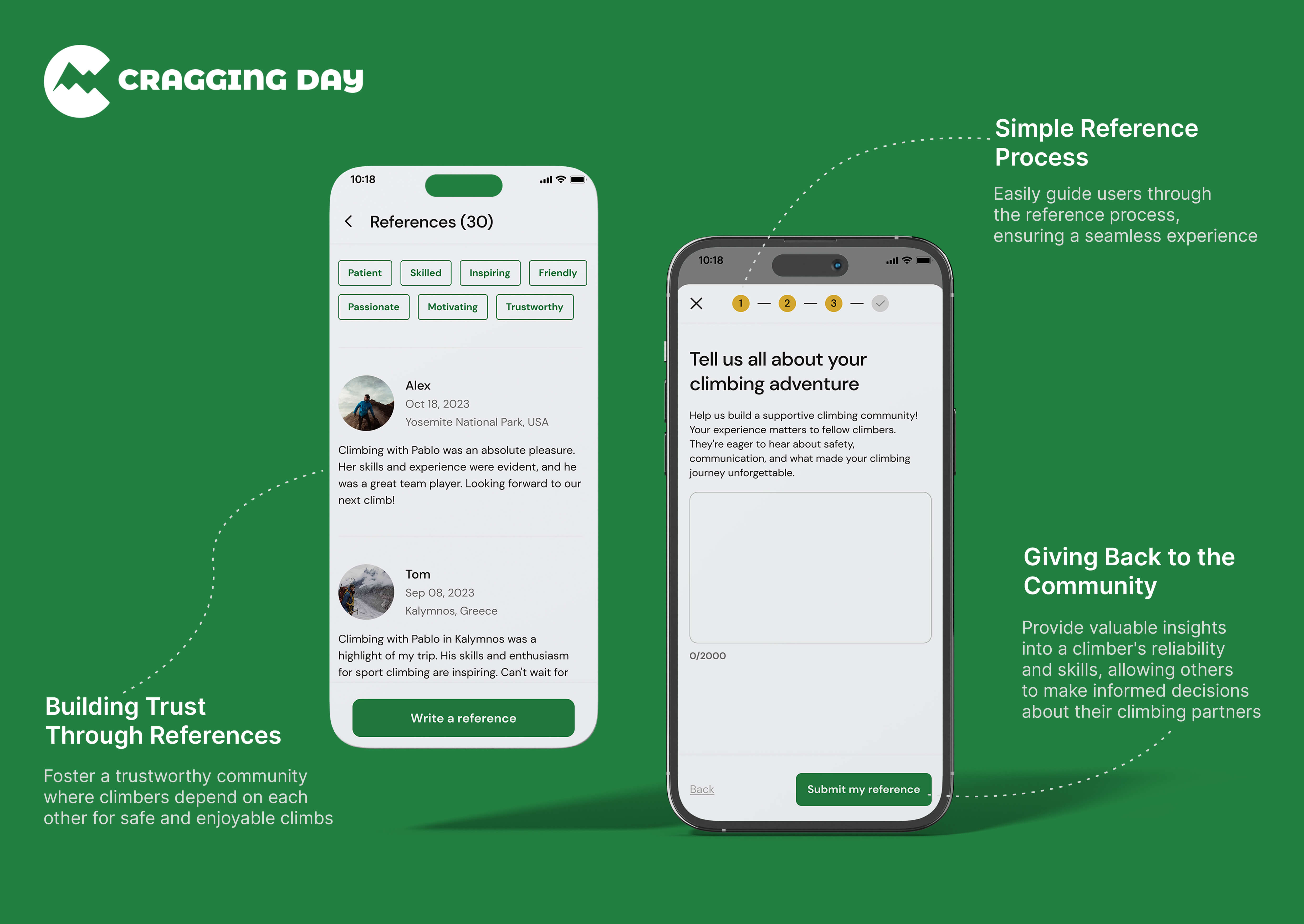
Cragging Day revolutionises the climbing experience by offering a comprehensive solution to the challenges faced by climbers. Through intuitive interfaces, the app enables users to seamlessly explore climbing opportunities based on their location and availability. The climber filtering feature ensures climbers find compatible companions, while the communication hub facilitates easy planning and sharing of climbing adventures. With a reference system enhancing safety, Cragging Day empowers climbers to connect, explore, and contribute to the creation of a thriving global climbing community.
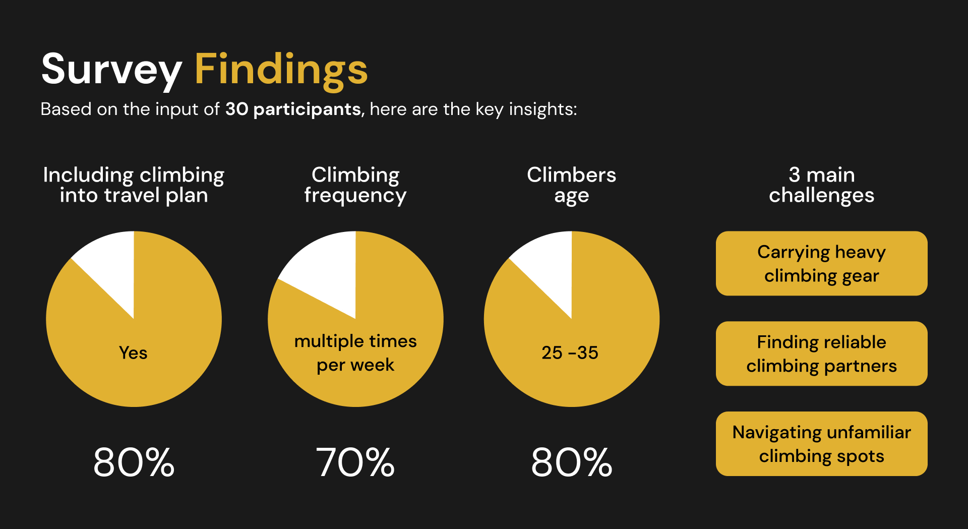
To validate that the problem isn't just a personal problem but exists among climbers, I conducted a survey to prove that. Based on the input of 30 participants, a striking 80% indicated that they include climbing in their travel plans. Moreover, 70% of climbers engage in climbing multiple times per week, underscoring the strong desire to explore climbing spots while travelling. Additionally, 80% of respondents fell within the 25 to 35 age group, highlighting a key demographic. Through this survey, I also identified three main challenges that climbers face while travelling.
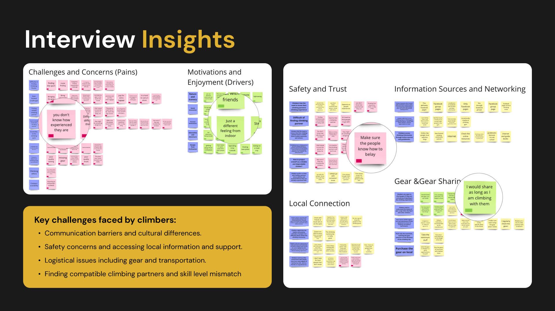
I interviewed six experienced climbers to gain insights into the challenges faced by both traveling and local climbers. The interviews were structured around three key research questions: 1, Understanding the challenges of 25-35-year-old rock climbers when exploring new locations during travel. 2, Exploring difficulties in local climbers partnering with individuals from different places. 3, How to create reliable connections between travellers and local climbers.
To capture the nuances of the conversations, I used Otter to record and transcribe the interviews. This method allowed for a detailed analysis of participants' responses, providing a foundation for the subsequent design process.
After gaining more insights from the climbers, I created two personas to help me empathise with the user's goals and needs. These two personas also serve as references throughout my design process, ensuring that my decisions align with the user's expectations.
Moving forward, I created journey maps for both Emily and Josef to visualise their user experiences while using the app. These maps provide valuable insights into what users need throughout their interactions with the platform.
1. User verification: Establish trust and reliability by verifying user identities.
2. Reference system: Enhance trust between traveling climbers and local climbers through a reference system.
3. Filter function: Enable travellers to filter and match with local climbers based on preferences and criteria.
4. Communication tools: Provide ways for traveling climbers to engage with matched local climbers.
1. Local climbing insights: Enable local climbers to share knowledge and tips about climbing spots.
2. Climbing preferences: Let climbers specify their climbing preferences, whether they prefer casual or extreme climbs, for better matching.
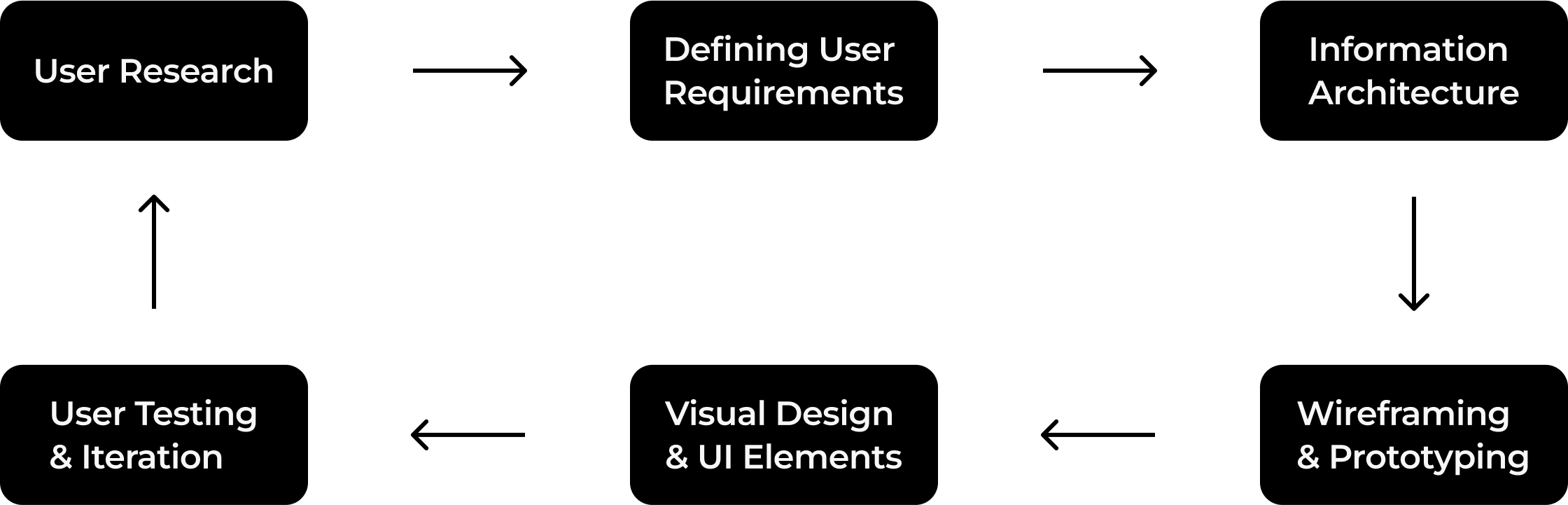
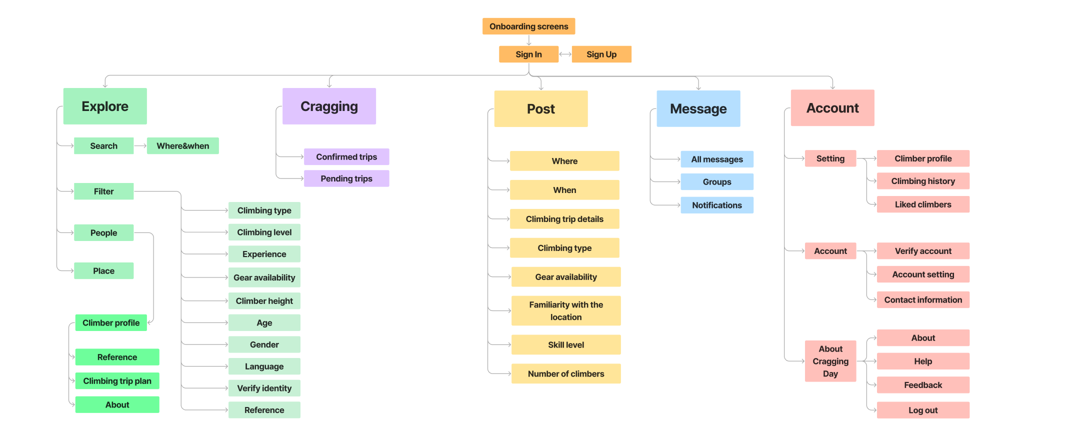
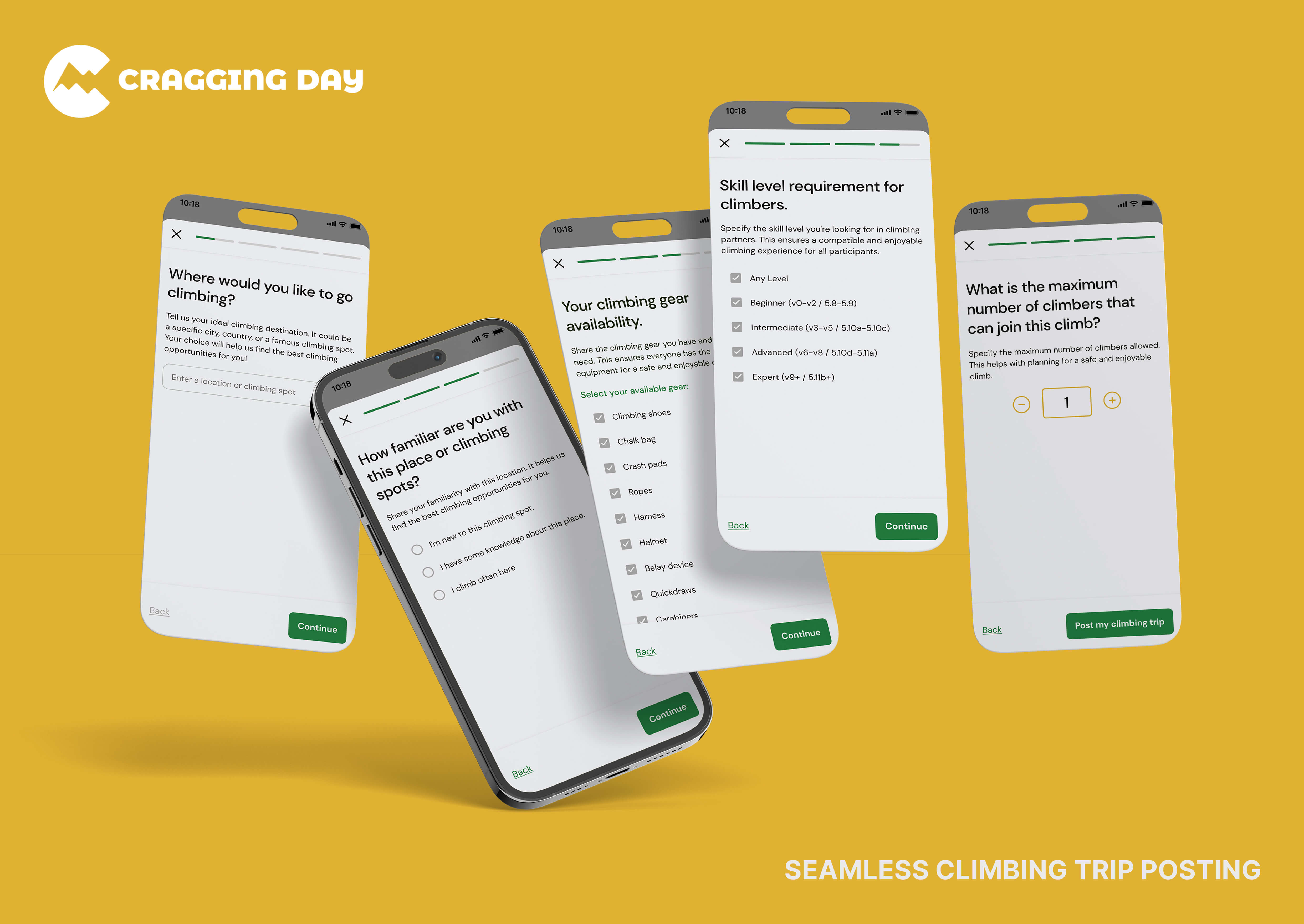
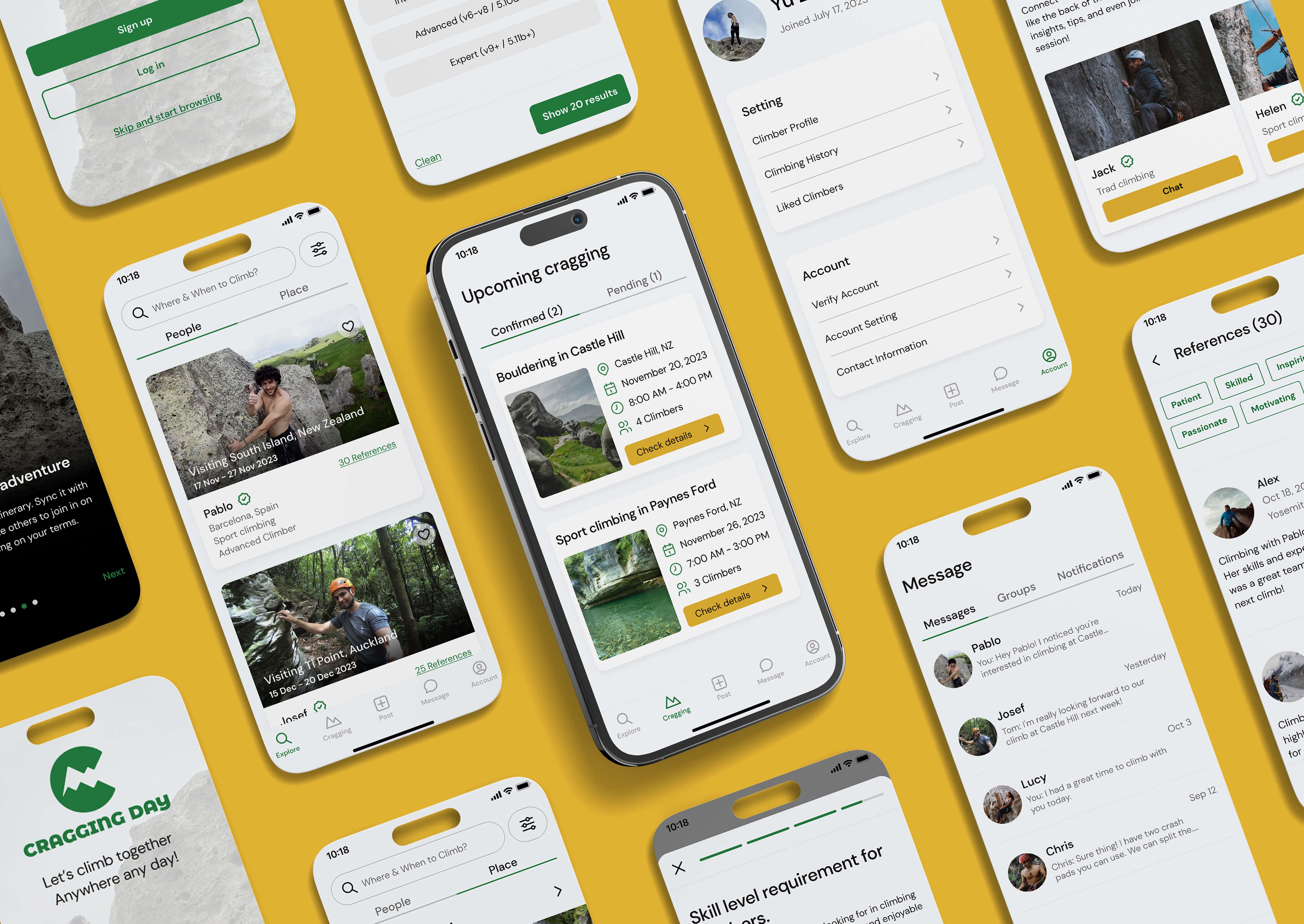
After I had a solid understanding of my users and their requirements, I started to build the information architecture. It has been iterated a few times, and this is the final version. The app allows users to search and filter climbers, check their climbing trips, post climbing trips, and chat with climbers.
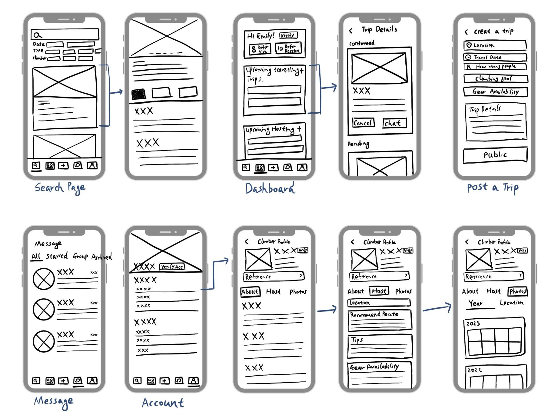
Before transitioning to digital design, I sketched some wireframes to visualise the app layouts. This approach allowed me to quickly test different ideas and gain a general idea of how the user experience flows.
During this stage, I concentrated on the key user flows and tested them with climbers to ensure they could understand each screen and complete the tasks smoothly.
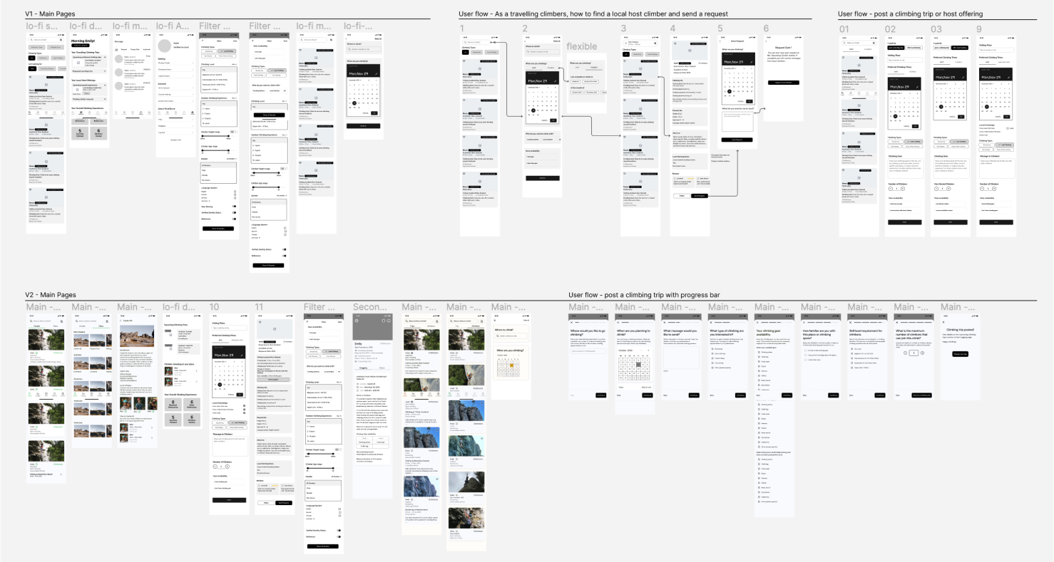
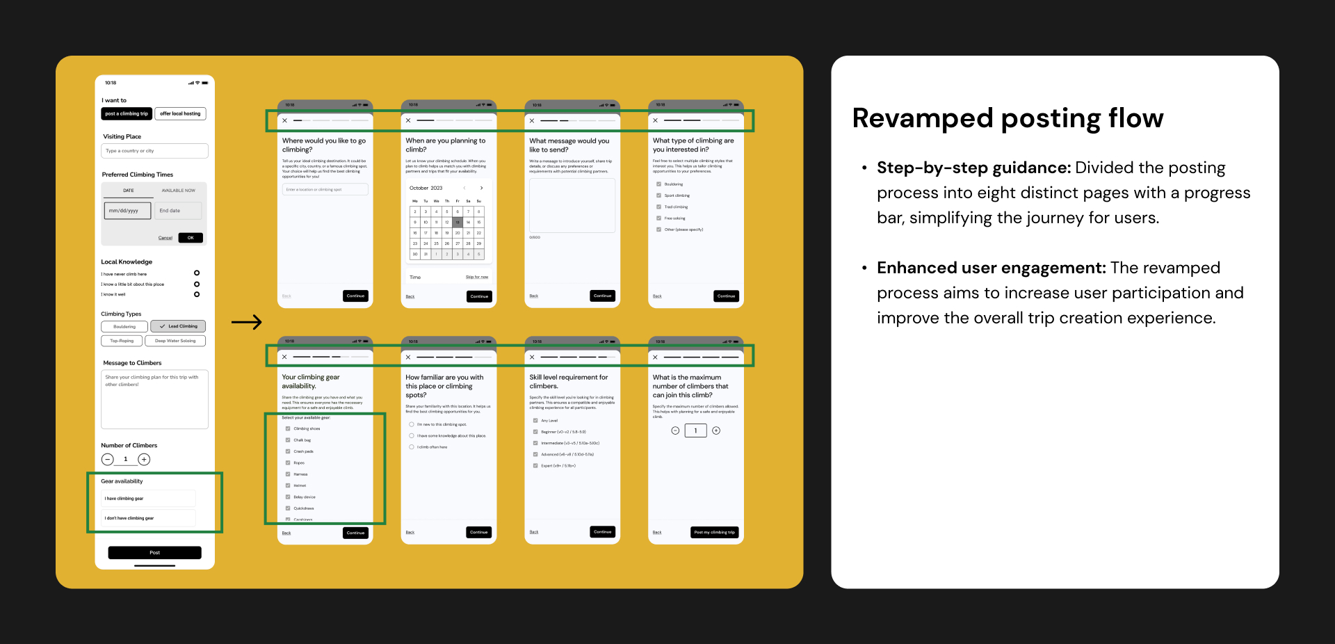
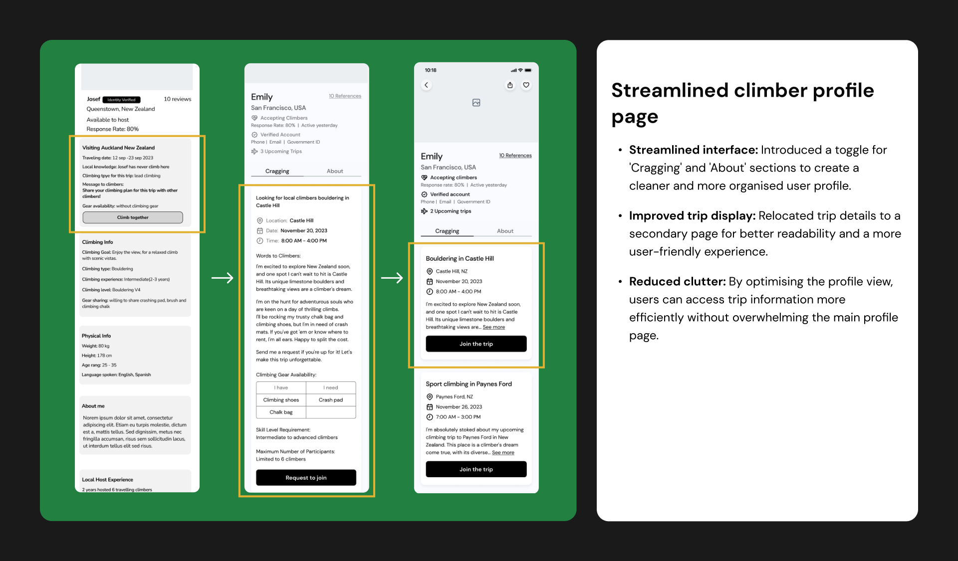
In the user testing stage, I assigned specific tasks to users and closely observed their interactions with the app. Their feedback provided invaluable insights, and I identified four key design enhancements based on the results of the user testing.

& UI Elements
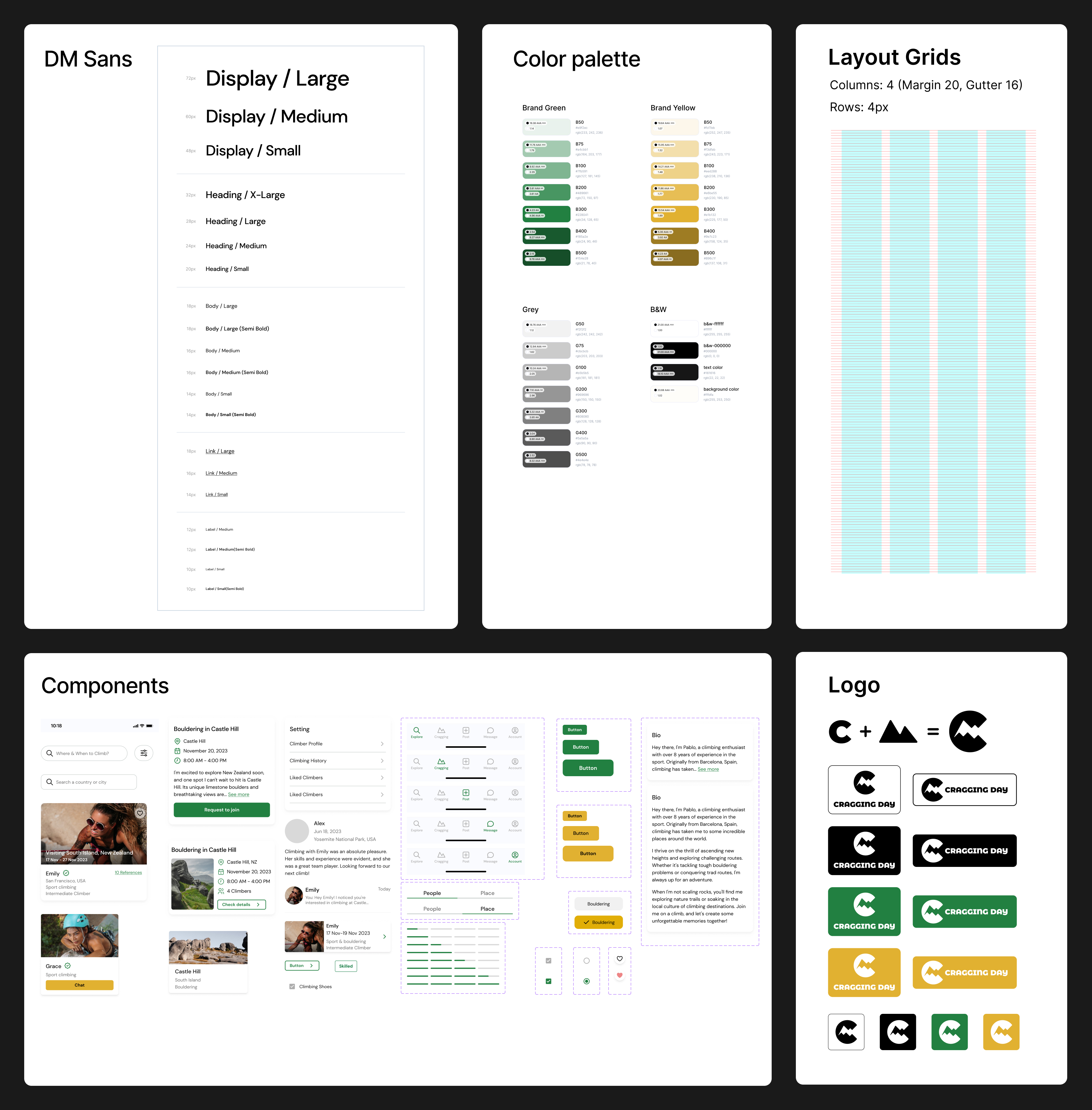
To maintain design consistency, I created a comprehensive design system with reusable components. I opted for the DM Sans typefaces, chosen for their excellent readability and modern, clean aesthetics. The utilisation of various font sizes and weights helped create a distinct hierarchy within the design. The brand colours—green, yellow, and white—were selected to evoke a sense of youth, energy, and fun, aligning with the exhilarating and dynamic nature of rock climbing. Additionally, I adhered to a 4-pixel-based spacing approach, ensuring precise hierarchy and visual balance across the entire app.
The brand name is Cragging Day. "Cragging" is a term commonly used in the climbing community to refer to the activity of climbing at a crag. It clearly communicates the focus on cragging and suggests a platform or community where climbers can plan or connect for a day of climbing. It's approachable and easy to remember. The logo combines the letter 'C' with a mountain shape, creating a bold and fun symbol.
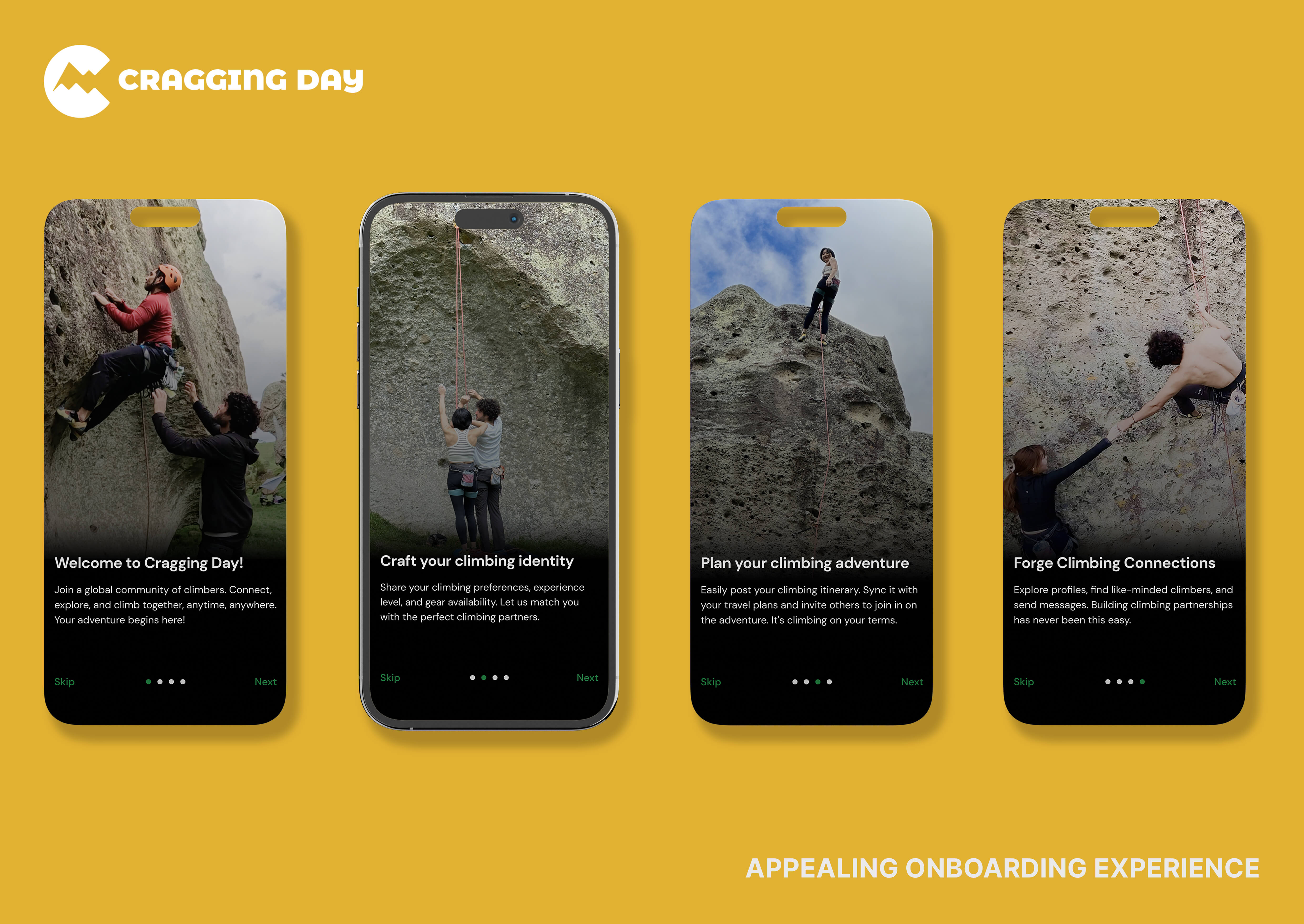
The project's final deliverables are high-fidelity prototypes. The user interface priorities simplicity and clarity, with thoughtfully chosen elements and an intuitive layout ensuring that navigating 'Cragging Day' is straightforward and enjoyable. Each screen is designed for accessibility, offering an easy-to-understand experience for climbers exploring new opportunities.
To showcase the final polished look, detailed mockups were created using Photoshop. These visuals serve as a realistic preview, highlighting the refined aesthetic and functionality of 'Cragging Day.' The mockups provide users with a compelling glimpse into the app's visual appeal and user interactions.
Next Steps
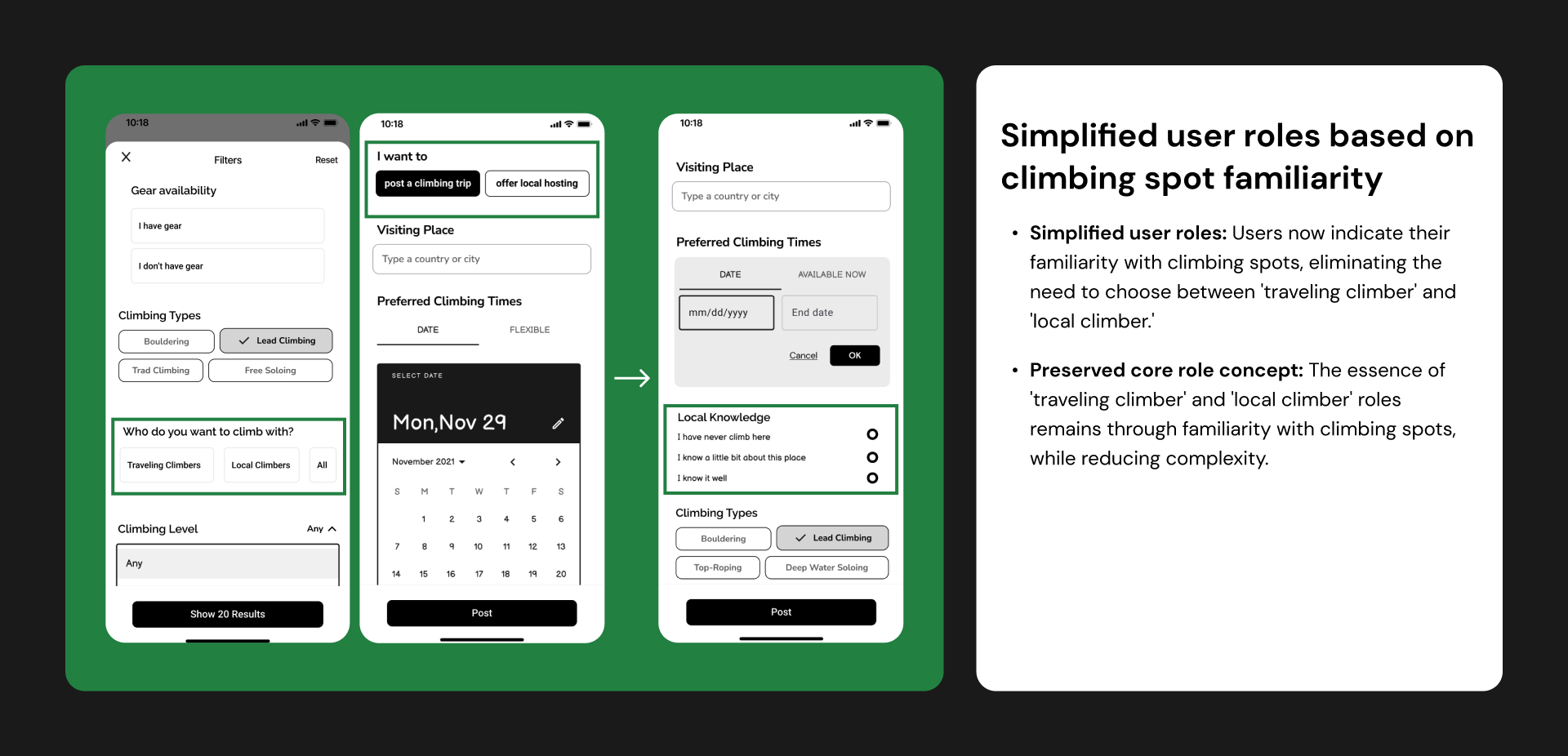
Reflecting on this four-month project, I can't help but marvel at how much I've learned and how my problem-solving skills have transformed. The big 'Aha!' moment for me came when I was trying to figure out how to differentiate between traveling and local climbers. Instead of asking users to label themselves, I thought, "Why not just look at their familiarity with climbing spots?" That simple shift made everything crystal clear and greatly improved the user experience.
Another thing I've learned is the incredible value of fresh perspectives. When you're knee-deep in a project, you can't always see the forest for the trees. Getting fresh eyes to look at your project always can provide valuable insight you might have missed.
Looking to the future, while this project has reached its conclusion as part of my university degree, it is the beginning of a new adventure for me. I'm considering working on it as a side project and collaborating with my partner, who's a developer. Our goal is to refine and potentially release it. Given our limited resources, we might start small, focusing on the Auckland climbing community, so I will need to refine the user flow and keep it simple and manageable. Constantly testing with climbers and ensuring an intuitive user experience. This will also serve as excellent practice for me as I step into the industry.